Data reports
Home Prices 'Fell' in 537 US Counties. Nearly Half Got More Expensive.
In Pueblo County, Colorado, the median sale price fell 3.4% last year. Per square foot, housing got 9.2% more expensive. That gap is not the market turning. It is which houses happened to sell.
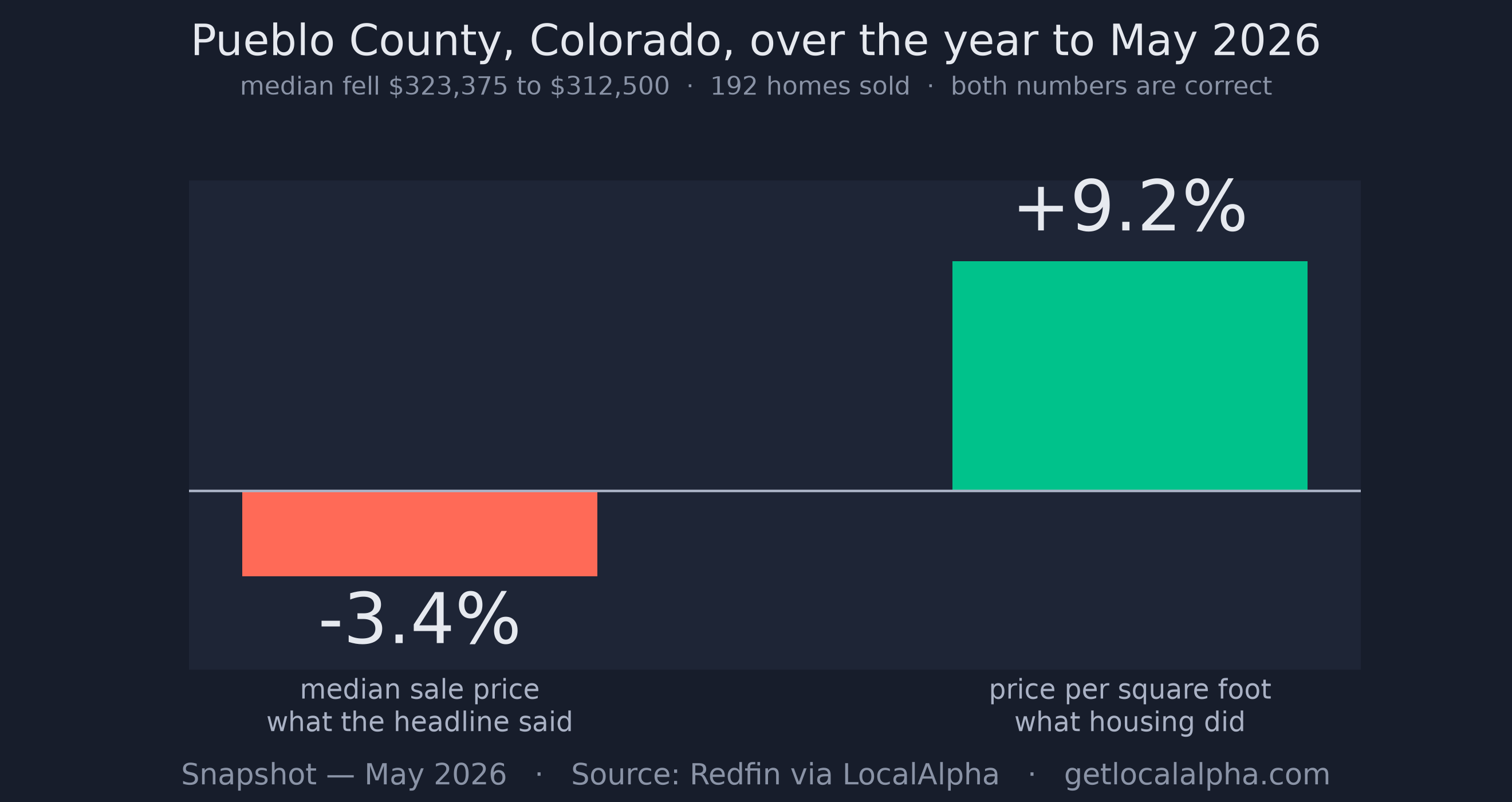
If you own a house in Pueblo County, Colorado, you were told this year that home prices there fell. The median sale price went from $323,375 to $312,500, down 3.4%.
Over the same twelve months, housing in Pueblo County got 9.2% more expensive per square foot.
Both numbers are correct. They come from the same source, the same county and the same year. Only one of them is telling you anything about what your house is worth.
It is not just Pueblo
We checked every county Redfin reports. Pueblo is one of hundreds where the headline number and the underlying one point in opposite directions, and they are not exotic places.
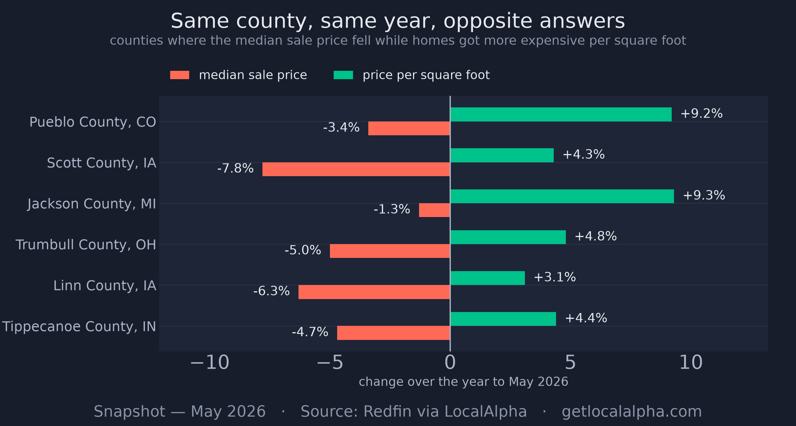
Scott County in Iowa, around Davenport. Trumbull County in Ohio, around Warren. Linn County in Iowa, Jackson County in Michigan, Tippecanoe County in Indiana. Ordinary, affordable places where somebody reads the local paper and decides what their biggest asset is worth.
In Jackson County the median slipped 1.3% while the per-foot price climbed 9.3%. A homeowner reading only the first number would conclude their market went backwards in a year it got meaningfully more expensive.
How both can be true
A median is not an average and it is not a valuation. It is the middle sale. Line up every house that sold in a county this May, and the median is whichever one sits in the middle of that line.
That means it moves when the mix of houses changes, whether or not any house changed in value. A year with more starter homes and fewer four-bedrooms will show a lower median even if every single property in the county gained value.
Price per square foot is not immune to that, but it is far closer, because it adjusts for the most important thing that differs between houses: their size. When the two disagree, the median is usually the one telling you about the sales mix rather than the market.
This happens every year, to about half of them
In the year to May 2026, 537 counties posted a falling median sale price. In 254 of them the price per square foot rose over the same period. That is 47% of the declines.
It is not a quirk of this year either. We ran it back to 2013:

In every year of the last fourteen, somewhere between 39% and 80% of the counties that reported falling prices were places where housing got more expensive per square foot. The long-run figure is close to half.
The two years that are almost entirely green are 2021 and 2022 — and they are the shortest bars on the chart, because almost nothing in America fell in those years. The handful of counties that did show declines were nearly all mix effects, which is why their green share reaches 78% and 80%. It has never dropped below 39% in any year.
What the data says
- 537 US counties reported a falling median sale price in the year to May 2026.
- In 254 of them, 47%, the price per square foot rose over the same year.
- That share has run between 39% and 80% every year since 2013.
- From 2013 to 2019, counties selling under 50 homes a year saw the median swing ±21.8% a year; sale-to-list swung ±2.1%.
It is worst exactly where people most want an answer
The fewer homes a county sells, the more its median jumps around, because each individual sale carries more weight in deciding where the middle lands.
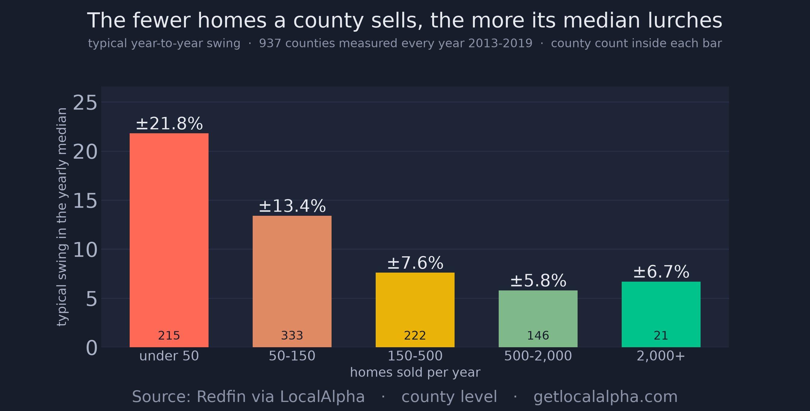
Standard deviation of the year-over-year change in the median sale price, by how many homes a county sells. Based on the 937 counties that qualified in every year from 2013 to 2019 — which needs 2012 present too, since each of those years is a change against the one before. Per Redfin data.
ExpandMeasured over 2013 to 2019 — stopping before the pandemic, which moved every market at once and would flatter the comparison — a county selling fewer than 50 homes a year saw its median swing about 22% annually. One selling 500 or more swung about 6%. In the smallest markets a double-digit "move" can happen with nothing at all going on underneath it.
The largest counties tick back up slightly, to 6.7%, and that band holds only 21 counties — few enough that one of them moving is visible in the average. The pattern is strong rather than perfect, and it would be poor form to smooth that away in a piece about not over-reading small numbers.
What a phantom decline actually costs
This is where it stops being a statistics quibble.
A seller who believes their market fell 5% prices accordingly, and in a county where the per-foot value actually rose, that is money handed to the buyer for no reason. On a $300,000 house, a 5% flinch is $15,000.
A buyer does the mirror image, crossing a market off the list because it looks like it is sliding, when the homes there are quietly getting more expensive. So does an investor screening counties on a single year of price change, which is exactly how a screen is usually built.
And a homeowner who reads that prices fell simply believes they are poorer than they are. Nothing in their life changed, and the number that told them so was measuring which of their neighbours sold this year.
Two better numbers
None of this means a small market is unreadable. It means the median is the wrong tool for one, and better tools are sitting next to it in the same report.
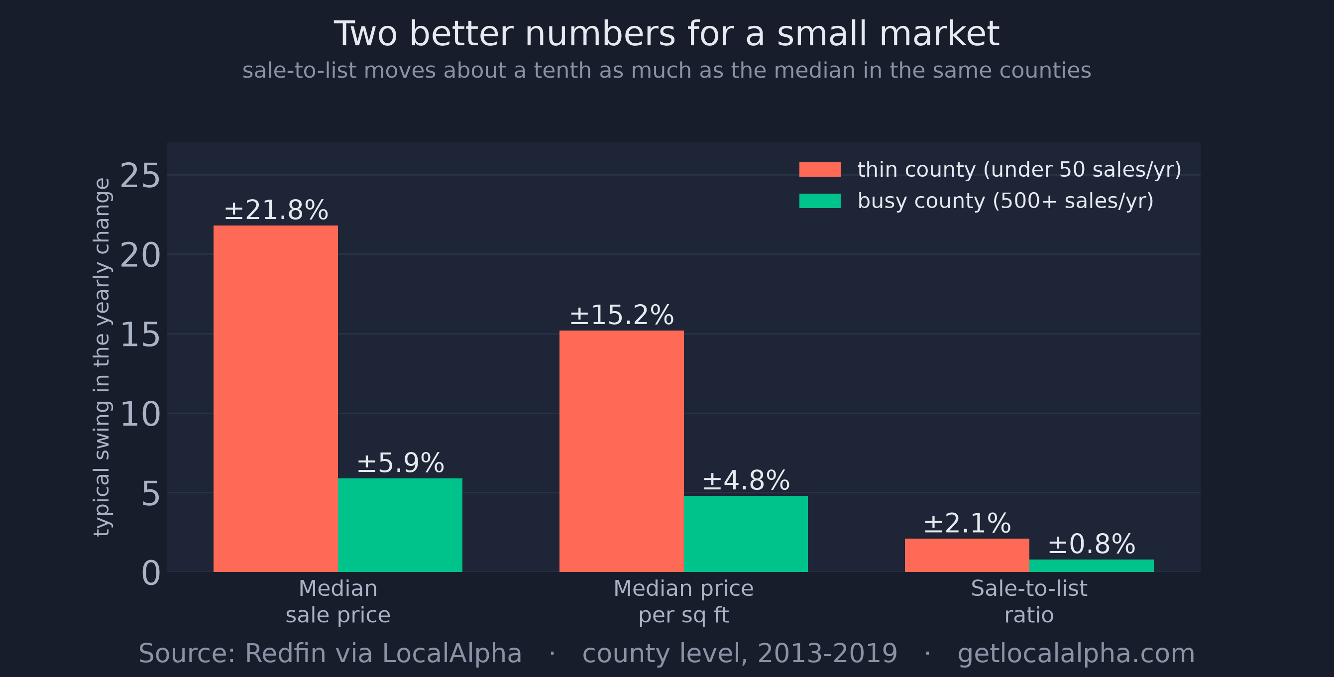
Price per square foot is the first fix, and it is the one that catches the Pueblo problem, because it adjusts for the size of whatever happened to sell.
Sale-to-list is the steadier one. It is what homes sold for as a share of what sellers asked, worked out for each sale and then averaged, so one unusual house barely moves it. In the same thin counties where the median swings 21.8%, it swings 2.1%.
Read together they answer different questions. Sale-to-list tells you who currently has the upper hand in a negotiation. Price per square foot tells you what the housing itself is doing. The median tells you what sold.
The honest limits
Real declines exist, and plenty of the 537 are real: in slightly more than half of them the per-foot price fell too. Two measures agreeing is a much stronger signal than either alone.
Price per square foot is also not a perfect fix. It adjusts for size and nothing else, so a year that trades more condos, or more fixer-uppers, can still push it around.
And every figure here needs a county to have sold at least 20 homes in both years being compared, which leaves out the very thinnest markets in the country. The problem is worse than measured in exactly the places most likely to be misread.
What to do with it
Next time you see that home prices fell in a place you care about, ask two questions before you believe it.
First: what did the price per square foot do? If it went the other way, you are looking at a change in what sold, not a change in what things are worth.
Second: how many homes does this place actually sell? Under a hundred a year, one year of median price is close to a coin toss, and the honest answer is that you have not learned much either way.
If your county is one of them, you can look it up rather than take our word for it: here are all 537 counties that reported a falling median in the year to May 2026, with what the price per square foot did over the same year, how many homes each sold, and the two median prices being compared. 254 of the 537 got more expensive per square foot while their headline number fell.
Check the price per square foot and sale-to-list for any market on the map.
Explore this market on the map
P.S. The uncomfortable part of this for us is that we publish county medians too, on every market page. The number is not wrong, it is just answering a narrower question than people think it is, and that is on whoever presents it rather than on the reader.
Frequently asked questions
How can home prices fall and get more expensive at the same time?
The median sale price is the middle house that sold, so it drops when cheaper or smaller homes make up more of the sales, even if no house lost value. Price per square foot adjusts for size, so it can rise in the same county over the same year. In the year to May 2026 this happened in 254 US counties.
Does a falling median price mean my house is worth less?
Not on its own. A county median is an aggregate of everything that sold and is not an appraisal of any one property. If the price per square foot in your county rose while the median fell, the median is describing the mix of homes that sold rather than what housing is worth.
What should I look at instead of the median sale price?
Price per square foot, because it adjusts for size, and the sale-to-list ratio, which is what homes sold for as a share of what sellers asked. Measured over 2013 to 2019, sale-to-list swung about 2.1% a year in small counties where the median swung 21.8%.
Why is the median so unreliable in small markets?
Because each sale carries more weight. Measured over 2013 to 2019, a county selling fewer than 50 homes a year had a median that swung about 22% from year to year, against about 6% in counties selling more than 500. In a small market a double-digit move can happen with nothing going on underneath it.
Are all reported price declines fake?
No. In slightly more than half of the 537 counties that reported a falling median in the year to May 2026, the price per square foot fell as well. When both measures move the same way, that is a far stronger signal than either on its own.
Metrics, all per Redfin data at county level and sampled each May from 2013 to 2026: median sale price, median price per square foot, sale-to-list ratio and homes sold. A county qualifies for a year only when it sold at least 20 homes in that May and in the May a year earlier, since every figure here is a change between the two; the named example counties each recorded at least 150. The median and per-square-foot volatility figures use the 937 counties that qualified in every year from 2013 to 2019, which requires 2012 as well; sale-to-list is reported less often, so its figures rest on the 918 counties that qualified for it. Charts are generated from the production database and stamped with their as-of date. See the methodology.
Last updated Aug 14, 2026