Investor guides
Buyer's or Seller's Market? How to Read Any Metro in 60 Seconds.
A repeatable way to size up any U.S. housing market fast — using one score, five bars, and four questions.

You're looking at a metro you don't know well. Maybe a relocation, maybe a deal someone pitched you. You have about a minute before your attention moves on. Here's how to spend it well.
The 60-second read, in four steps
- Start with the Alpha Score and its temperature label — your headline read of who has leverage.
- Check inventory health. Tight supply means sellers hold the cards; loose supply means buyers do.
- Read price momentum next to inventory to tell a real seller's market from a market past its peak.
- Sanity-check affordability and economic strength to know whether the read will hold.
What each step is actually looking for
Step 1 — the score and label. The Alpha Score (0–100) and its temperature label are your one-glance verdict. Above 60 leans seller; 40–59 is balanced; below 40 leans buyer. That's the headline. The next three steps are about whether to trust it.
Step 2 — inventory health. This is the leverage dial. The number underneath it is months of supply: under two months is a tight seller's market, four to six is balanced, and above six tilts to buyers. The Inventory Health bar is inverted on purpose: a high bar means supply is tight and sellers have leverage; a low bar means supply is loose and buyers have room.
Step 3 — momentum next to inventory. This pairing is where the read gets sharp. Rising prices on tight supply is a genuine seller's market with fuel in the tank. Rising prices on loosening supply is a market that has likely already peaked, with the price line simply not caught up to the inventory line yet. Always read the two together.
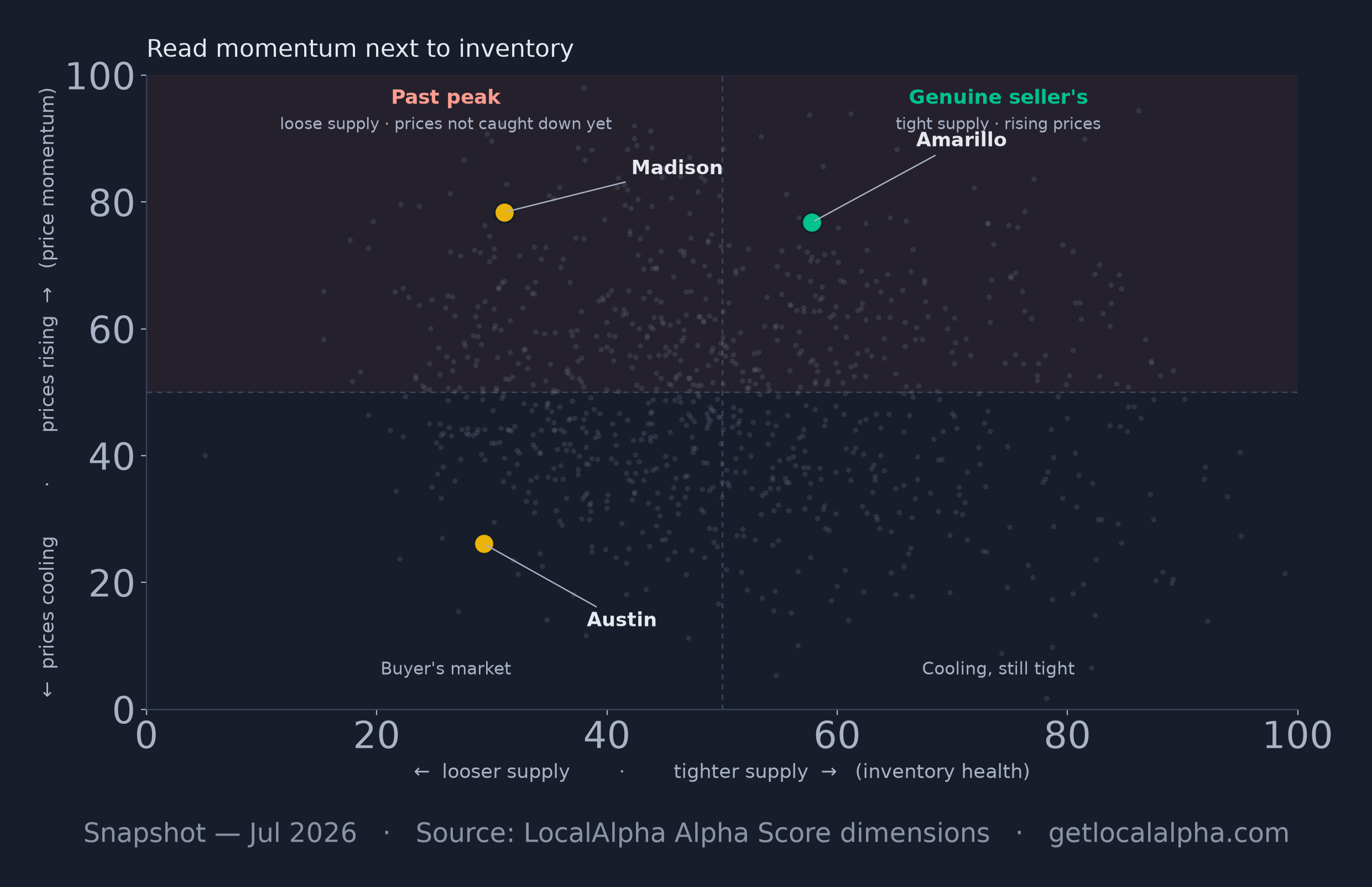
Every U.S. metro plotted by price momentum (vertical) against inventory health (horizontal, where right means tighter supply). Rising prices on tight supply — top right — is a genuine seller's market; rising prices on loosening supply — top left, where Madison sits — is a market that has likely already peaked. As of Aug 2026.
ExpandStep 4 — affordability and jobs. These tell you whether the read will hold. A seller's market with strong jobs and room on affordability can stay hot. A seller's market where affordability is already stretched is running on borrowed time. This is the step that keeps you from being surprised next quarter.
What the temperature labels mean
LocalAlpha translates the Alpha Score into a plain label so you don't have to memorize cutoffs:
- Hot Seller's
- 75+ — sellers hold all the leverage
- Seller's
- 60–74 — tilted toward sellers
- Balanced
- 40–59 — neither side dominates
- Buyer's
- 25–39 — tilted toward buyers
- Deep Buyer's
- under 25 — buyers hold the leverage
Worth knowing before you lean on the label: the bands are not evenly populated. Here is where every U.S. metro actually falls.
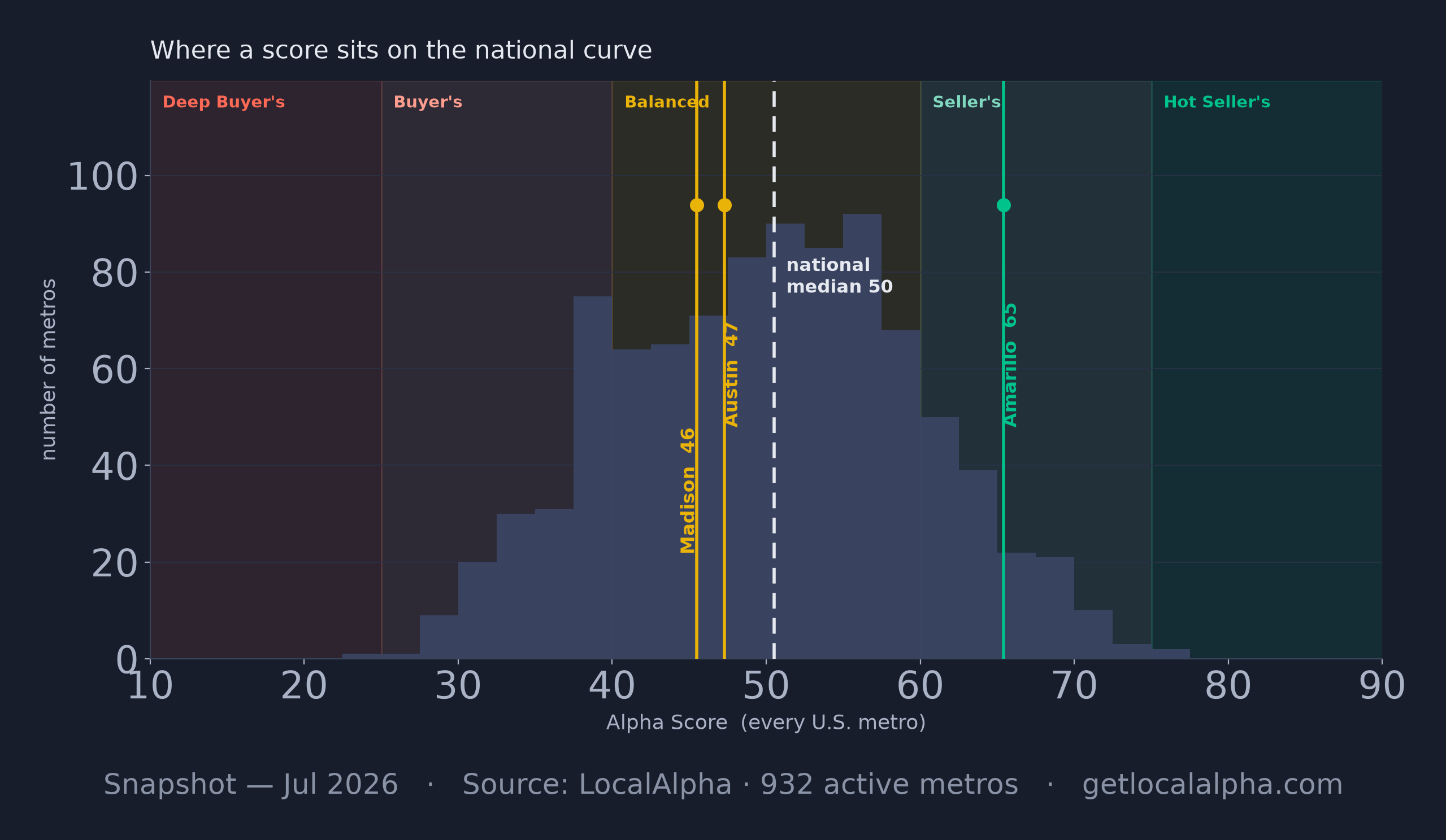
Two things fall out of that curve. The national median is 50, and the bulk of 943 metros sits in the Balanced band, so "balanced" is the default condition rather than a finding. And the Hot Seller's band above 75 is very nearly empty, so the label people reach for first describes almost nothing — all three markets here, Amarillo included at 57, land inside Balanced.
A worked example
Here is the read on Austin in one glance: the score, the label, and the date the data is from.
Austin, TX metro area
Data as of Aug 2026
Austin lands in the balanced band, but the bars tell the real story: price momentum has gone cold (prices are about 21% off their 2022 peak) and supply has loosened past five months, while a solid local economy and mid-pack affordability are what hold the score up. Rental yield is the one to watch — it has fallen hard, because Austin rents are now declining year over year, not merely growing slowly. Sixty seconds, and you know both what the market is and why. Now compare another balanced market, Madison, Wisconsin, which reaches the same label a completely different way.
Madison, WI metro area
Data as of Aug 2026
Madison sits in the balanced band too, but for the opposite reason. Its price momentum is strong while affordability is stretched, the mirror image of Austin's cold-momentum-but-roomier profile. Two markets, the same label — and two completely different stories underneath. That's the whole point of reading the bars instead of just the headline number.
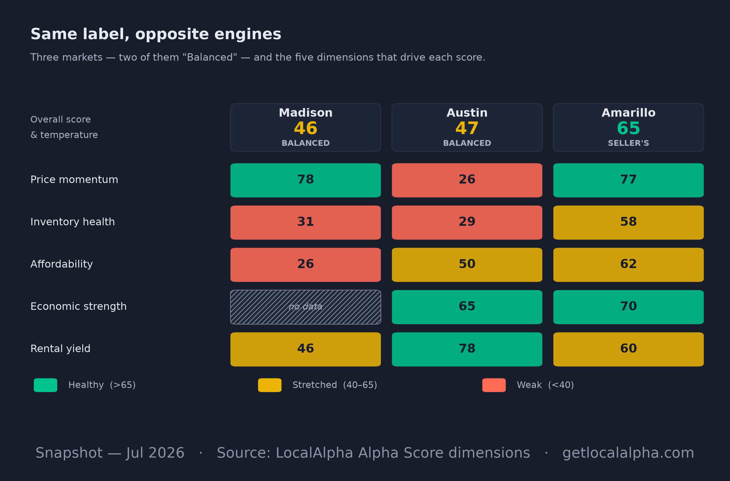
The same five dimensions for all three markets. Madison and Austin both score Balanced (48 and 41) — but Madison runs on hot price momentum while Austin's has gone cold and its affordability is roomier. Amarillo scores Balanced too at 57, on a broader base: no dimension below 39. As of Aug 2026.
ExpandLook at the two Balanced columns as a pair. Seven points separate them and they carry the same label — but their floors are opposites. Madison's floor is affordability at 27, holding down a market whose price momentum runs 70. Austin is the mirror on those two axes: momentum is the cold side at 32, while affordability sits nearly twice as high at 51. (Austin's actual lowest bar is inventory health at 28 — loose supply is the other half of why the momentum went.) One label, two opposite engines, which is the whole reason to read the bars instead of the badge.
Common mistakes when reading a market
- Reading the score alone. Two markets can share a label for opposite reasons — always glance at the five bars.
- Ignoring the date. A score is a snapshot; check the as-of date before you act on it.
- Treating a high score as a buy signal. It measures conditions, not future prices.
- Forgetting affordability. A hot market with stretched affordability is the one most likely to turn.
Now go run it on a market you actually care about.
See the full Austin breakdown, then try your own market.
Open a market page
P.S. The sixty seconds is real, but the badge is the part I would skip. Two markets can share a label and disagree about everything underneath it, and the bars take about ten seconds longer to read.
Frequently asked questions
What's the difference between a buyer's and a seller's market?
A seller's market has tight supply and rising prices, so sellers set the terms; a buyer's market has ample supply and softer prices, so buyers do. On LocalAlpha, a score of 60+ leans seller, under 40 leans buyer, and 40–59 is balanced.
What if a market is missing data?
Where a dimension has no real local data we leave it out of the score entirely and re-scale the remaining weights, so the score is an average of what we actually measured. The dimension shows as "—", never as a number. If fewer than three of the five can be measured we publish no score at all, which is why smaller and rural markets often show a blank. (Updated 2026-09: these dimensions previously fell back to a neutral 50, so older versions of this piece told you to treat a near-50 reading as "unknown" — there is no longer a placeholder to misread.)
How often should I re-check a market?
Monthly is plenty for most decisions. Scores recompute as new data lands, and the temperature label rarely swings overnight — but inventory can move fast, so re-check before you make an offer.
Can a market be a balanced market and still favor one side?
Yes. A balanced overall score can hide a lopsided profile — strong momentum offset by poor affordability, for instance. That's exactly why the four-step read looks past the single number to the bars underneath.
Methodology: temperature labels are cut from the overall Alpha Score (Hot Seller's 75+, Seller's 60–75, Balanced 40–60, Buyer's 25–40, Deep Buyer's under 25); the dimensions and their weights are on the methodology page. Figures are per Redfin (prices, supply), Census ACS (income, rent) and BLS (jobs, wages). Score cards and charts are snapshots as of the date each one states, not live reads.
Last updated Sep 11, 2026