Methodology
What Actually Makes a Housing Market "Hot"? We Scored 900 of Them.
Five forces decide whether a market favors buyers or sellers — and whether the heat will last. Here is what each one measures, in plain English.

"Hot market" is one of those phrases everyone uses and no one defines. It usually means prices are going up and homes sell fast. Fine, but that's the symptom. The useful question is what's underneath it, because the same surface heat can sit on a healthy foundation or a shaky one.
LocalAlpha breaks every market into five forces, scores each 0–100, and blends them into one Alpha Score. Two of those forces create the heat. The other three decide whether it lasts. Get that distinction and you can read any market in the country.
The five forces behind every market
The five dimensions, in one line each
- Price Momentum — how fast prices are moving (sale-price growth, sale-to-list ratio, the house price index).
- Inventory Health — how tight supply is (months of supply, active and new listings). Tight supply favors sellers.
- Affordability — prices measured against local incomes and mortgage burden. The ceiling on how far heat can run.
- Economic Strength — jobs and wages (unemployment, job growth, average pay). The fuel for sustained demand.
- Rental Yield — income potential relative to price. What investors actually care about.
What each force is really telling you
Price Momentum is the one everyone watches. Rising prices mean demand is outrunning supply. But momentum is a coincident signal, not a leading one: by the time it's screaming, you may be late. High momentum stacked on weak affordability is the classic late-cycle setup.
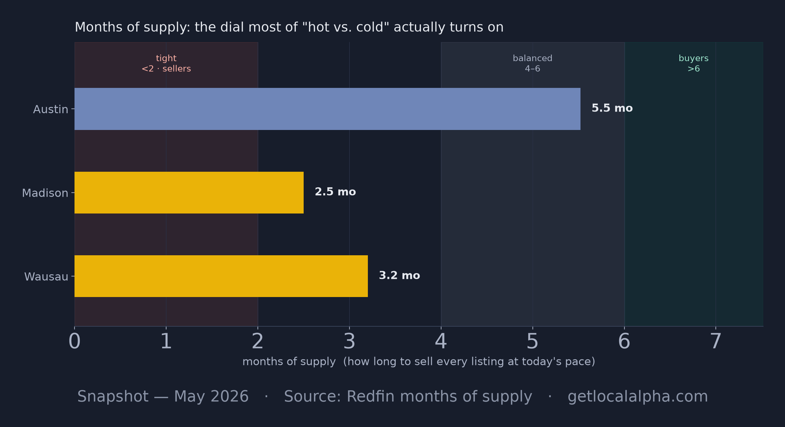
Inventory Health is the leverage dial. The cleanest read is months of supply: how long it would take to sell every listed home at the current pace. Under two months and sellers run the table; above six and buyers do. Most of what people feel as "hot" or "cold" is really this number moving.
Affordability is the ceiling. It compares prices to what local households actually earn. A market can run hot for a while on cheap money or out-of-town buyers, but when prices detach from local incomes, the heat is borrowed. Affordability is what tells you whether a hot market has room left.
Economic Strength is the fuel: jobs, wages, unemployment. Demand backed by a growing payroll is durable. Demand backed by speculation is not. Two markets can look identical on price until a downturn separates the one with jobs from the one without.
Rental Yield is the investor's floor, meaning annual rent relative to price. High yield means the math works even if appreciation stalls. It's the dimension homebuyers ignore and investors live by.
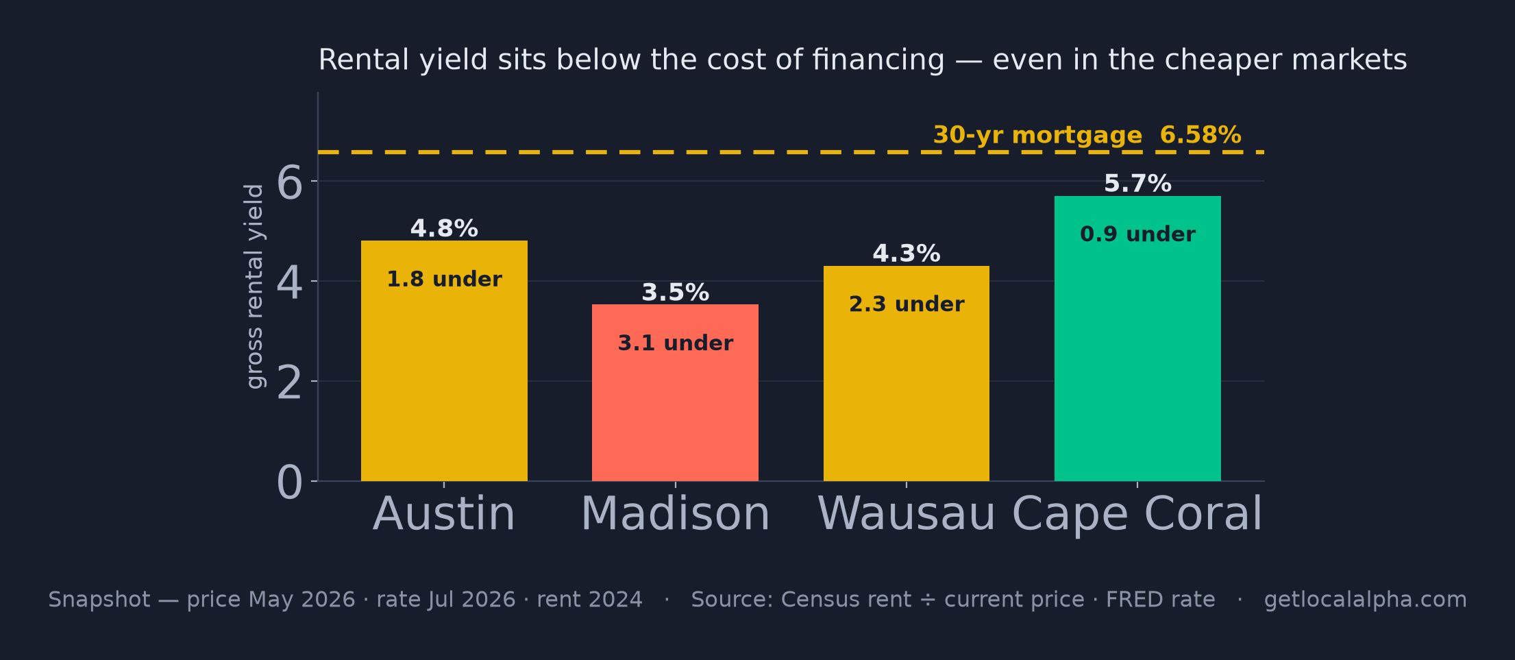
Gross rental yield against the cost of financing. At today's rates the rent does not cover the mortgage in any of these markets — the question is the size of the gap. Snapshot; yield divides the latest Census rent (2024) by the current price, so the rent side lags by design — the annual survey is the freshest market rent published.
ExpandLine that up against the momentum bars and the order inverts. Madison, running hot on price momentum at 70, has the weakest yield of the four at 3.5%, a full 3.1 points under the cost of borrowing. Cape Coral, which nobody is calling hot, comes within a single point of covering its financing on rent alone. Heat and the rent that would justify it are not the same reading, and this is the chart where they come apart.
Hot isn't the same as healthy
Here is the part most "hot market" lists miss. Momentum and inventory create the heat. Affordability and the economy decide whether it lasts. A market with rocketing prices, no inventory, and stretched affordability is hot the way a sprinter is fast — impressively, briefly. A market with steady jobs, room on affordability, and balanced supply can stay strong for years without ever looking dramatic.
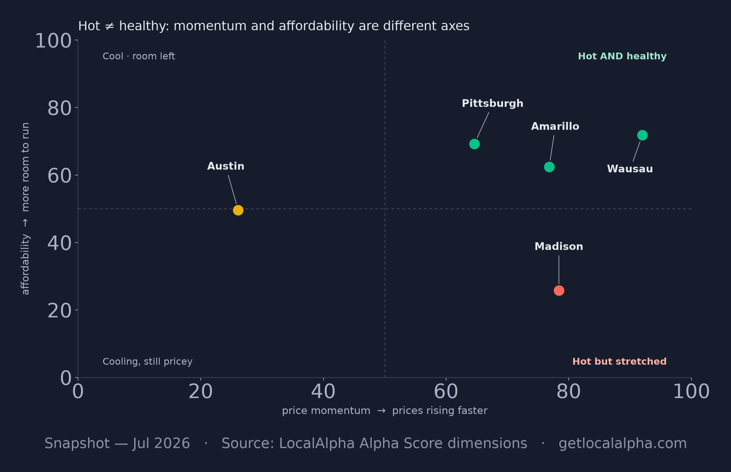
That's why the Alpha Score isn't just price momentum with extra steps. A market can post strong momentum and still score in the middle, because the other forces are flashing caution.
Two real markets, side by side
Austin spent two years as the national symbol of a hot market. Here's where it lands today:
Austin, TX metro area
Data as of Aug 2026
Read the bars and the story tells itself: momentum has cooled and supply has loosened (inventory health is low), while affordability actually sits middling, since payments still land under the 30% line. The heat came off not because Austin stopped being a good city, but because supply caught up: months of supply climbed back toward balanced and prices fell more than 20% from their 2022 peak, even with a still-solid local economy.
Now compare Madison, Wisconsin, a market almost nobody calls "hot":
Madison, WI metro area
Data as of Aug 2026
Madison's price momentum is actually strong, stronger than Austin's. But it's the less affordable of the two (price-to-income above 5, payments past 30% of income), and that ceiling caps how hot it can run, so it sits balanced. Same country, opposite shapes: Austin cooled from the top on loosening supply; Madison is pinned by its affordability ceiling. Neither story is visible from price alone.
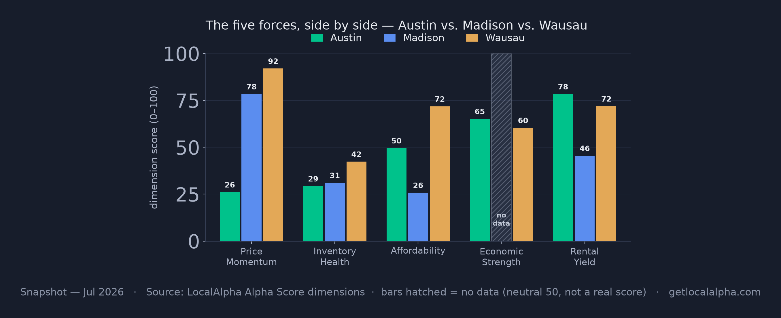
The five forces side by side. The shapes are opposite: Madison is high momentum / low affordability, Austin the reverse, and Wausau strongest on four of the five, trailing Madison on inventory health. Madison's Economic Strength now reads a real 74. When this piece first ran that bar was a neutral 50 standing in for jobs data we did not yet have — which is exactly why a near-50 bar was a prompt to dig rather than a verdict. Since 2026-09 there is no such bar to misread: a dimension we cannot measure shows no value and is left out of the score.
ExpandHow the five become one score
The Alpha Score is a weighted blend: Inventory Health (25%), Price Momentum (20%), Affordability (20%), Economic Strength (20%), and Rental Yield (15%). Each dimension is ranked against peer markets of the same type, so a ZIP is compared to ZIPs, not to a whole metro. Where a market has no real data for a dimension we leave it out and re-scale the remaining weights, and below three of the five we publish no score at all. The full weighting is set out at the foot of this piece.
So next time someone calls a market "hot," the useful follow-up is: hot on which force, and can it last? The answer is almost always sitting right there in the five bars.
Pull up any market and read its five forces yourself.
Explore the map
P.S. The bar I misread for the longest time was Economic Strength. A neutral 50 looked like a verdict and was usually an absence, and I have talked myself into markets on the strength of a number that was really a shrug. We stopped printing that number in September 2026 — an unmeasured dimension now shows nothing at all, which is the honest version of the same thing.
Frequently asked questions
What is a good Alpha Score?
It depends on which side of the deal you're on. 60+ favors sellers, 40–59 is balanced, and under 40 favors buyers. A high score isn't universally "good" — it's good for sellers and tougher for buyers. Read the number relative to your goal.
Does a high Alpha Score mean home prices will go up?
No. The score measures current conditions, not future prices. Strong fundamentals make a market more resilient, but the Alpha Score is a read on where things stand today — not a forecast.
What is a healthy months of supply?
Roughly four to six months is considered balanced. Under two months is a tight seller's market; over six months tilts toward buyers. It's the single most telling inventory number.
Is a hot market a bad time to buy?
Not necessarily. A hot market means less leverage and more competition, but if affordability still works for you and your time horizon is long, it can still make sense. The danger is buying heat that affordability can't sustain.
How often is the Alpha Score updated?
It recomputes as new data lands — Redfin market data as its monthly release is brought in, government series (Census, BLS, FHFA) monthly to annually. Every score on the site shows the date its data is from.
What's the difference between a buyer's and a seller's market?
A seller's market has tight supply and rising prices, giving sellers leverage; a buyer's market has ample supply and softer prices. Our 60-second guide walks through how to tell which one any metro is in.
Methodology: the five forces are the Alpha Score dimensions (Price Momentum, Inventory Health, Affordability, Economic Strength and Rental Yield), weighted as described on the methodology page. Figures are per Redfin (prices, supply), Census ACS (income, rent) and BLS (jobs, wages). Score cards and charts are snapshots as of the date each one states, not live reads.
Last updated Sep 11, 2026