Investor guides
How to Tell If a Housing Market Is Overvalued (5 Public-Data Signals)
Five public-data signals tell you whether a market's prices have run past the fundamentals that support them — and you can check every one yourself.
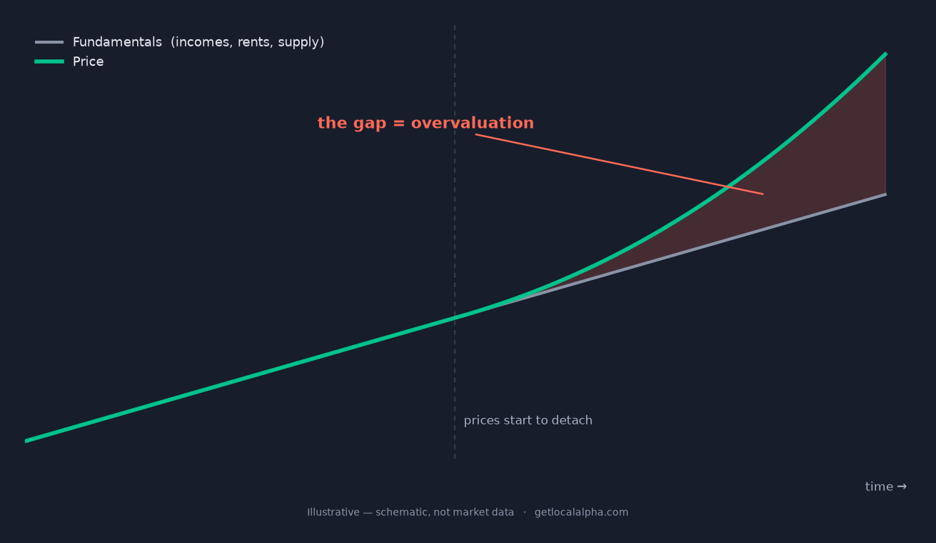
"Overvalued" gets pinned on any market with a big price tag. That is the wrong test. A $600k market can be fairly valued and a $200k market badly overvalued. What matters is the gap between price and the fundamentals underneath it.
The good news is that the gap is measurable, and the inputs are public. Five signals do the work, and each maps to a number you can pull yourself: income, mortgage rates, inventory, sale prices, and a market's own price history. No black box, no vibes.
What does "overvalued" actually mean?
A market is overvalued when prices have detached from the things that actually pay for housing: local incomes, rents, the balance of supply and demand, and the market's own price history. Each signal below tests one of those anchors.
One stretched reading is a yellow flag with a dozen innocent explanations. Several stretched readings at once, all pointing the same way, are the real thing. Hold that distinction. It is the difference between a hot market and an overvalued one.
Why do markets get overvalued in the first place?
Prices do not float away from fundamentals at random. A few familiar forces push them there, and naming the force tells you how fragile the gap is.
Four ways a market detaches from its fundamentals
- Cheap or falling mortgage rates. When borrowing gets cheaper, buyers can bid more for the same monthly payment, so prices rise even when incomes do not. That gap is rate-driven, and it reverses when rates do.
- Outside money. Out-of-state buyers and investors priced for a different market can lift local prices well above what local paychecks would ever support.
- Supply that cannot respond. Zoning, geography, and slow permitting cap new building, so a surge in demand has nowhere to go but price.
- Narrative and FOMO. Once a market becomes "the place to be," buyers chase it on story rather than math, and momentum feeds itself until it does not.
The first two are the most reversible. A market floating on cheap credit or hot money can deflate fast when the rate cycle or the sentiment turns. Supply-constrained appreciation is stickier, which is why the signals below always get read against a market's own history, never a single national rule.
The five signals that reveal it
Each signal isolates one fundamental and asks whether price has run ahead of it. None of them requires anything you cannot pull from public data. Read them in order, then read them together.
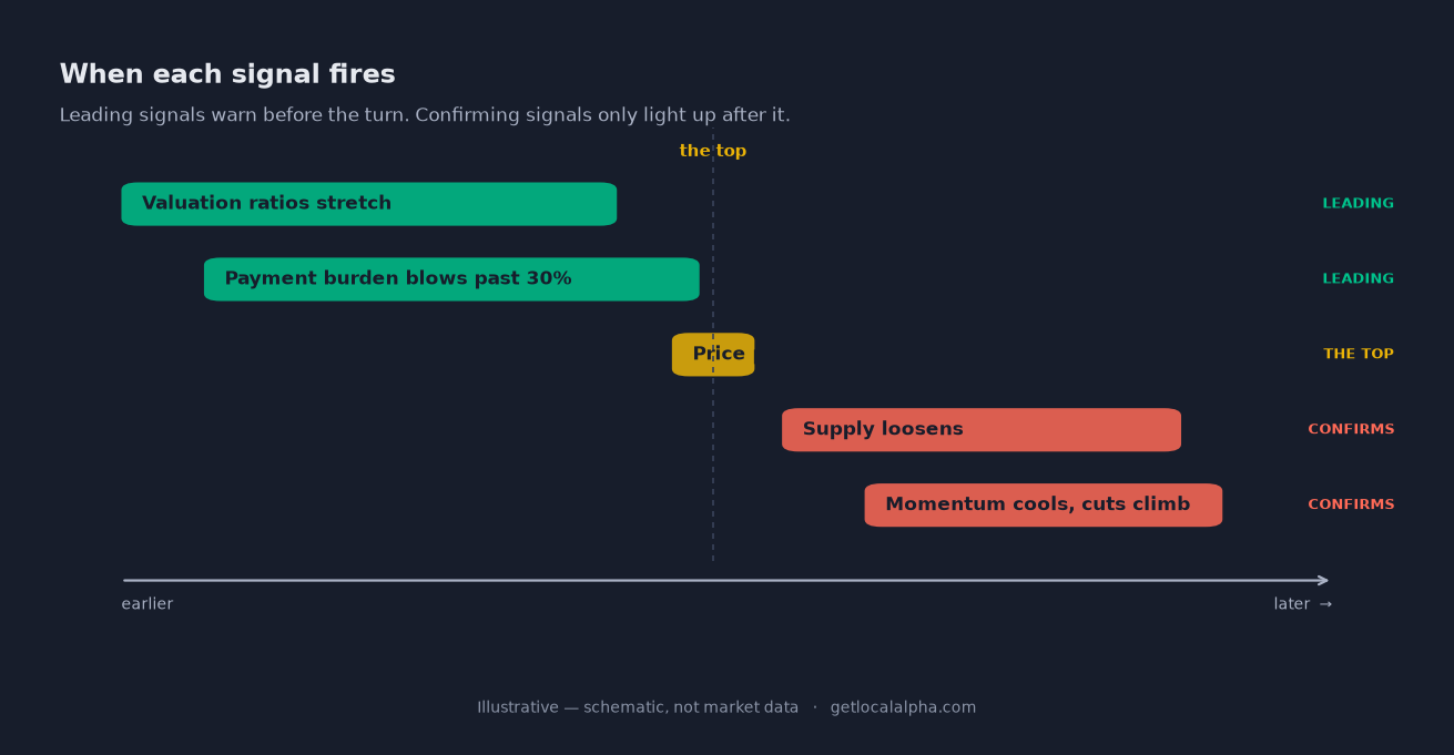
One thing to hold as you go: these five are not equal in when they fire. The first two — the valuation ratios and the payment burden — are leading: they tell you the standing risk a market carries before anything moves. Price-versus-trend is context. The last two — supply and momentum — are confirming: they only flip after a top is already forming. A leading signal warns; a confirming signal dates the turn. Spot overvaluation early and you are reading the first two; the last two just tell you the clock has started.
Price-to-income
Census
income vs. price
Payment-to-income
Fed rate
affordability
Months of supply
Listings
inventory
Sale-to-list & drops
Listings
momentum
Price vs. trend
FHFA HPI
context
Signal 1: Is the price-to-income ratio stretched?
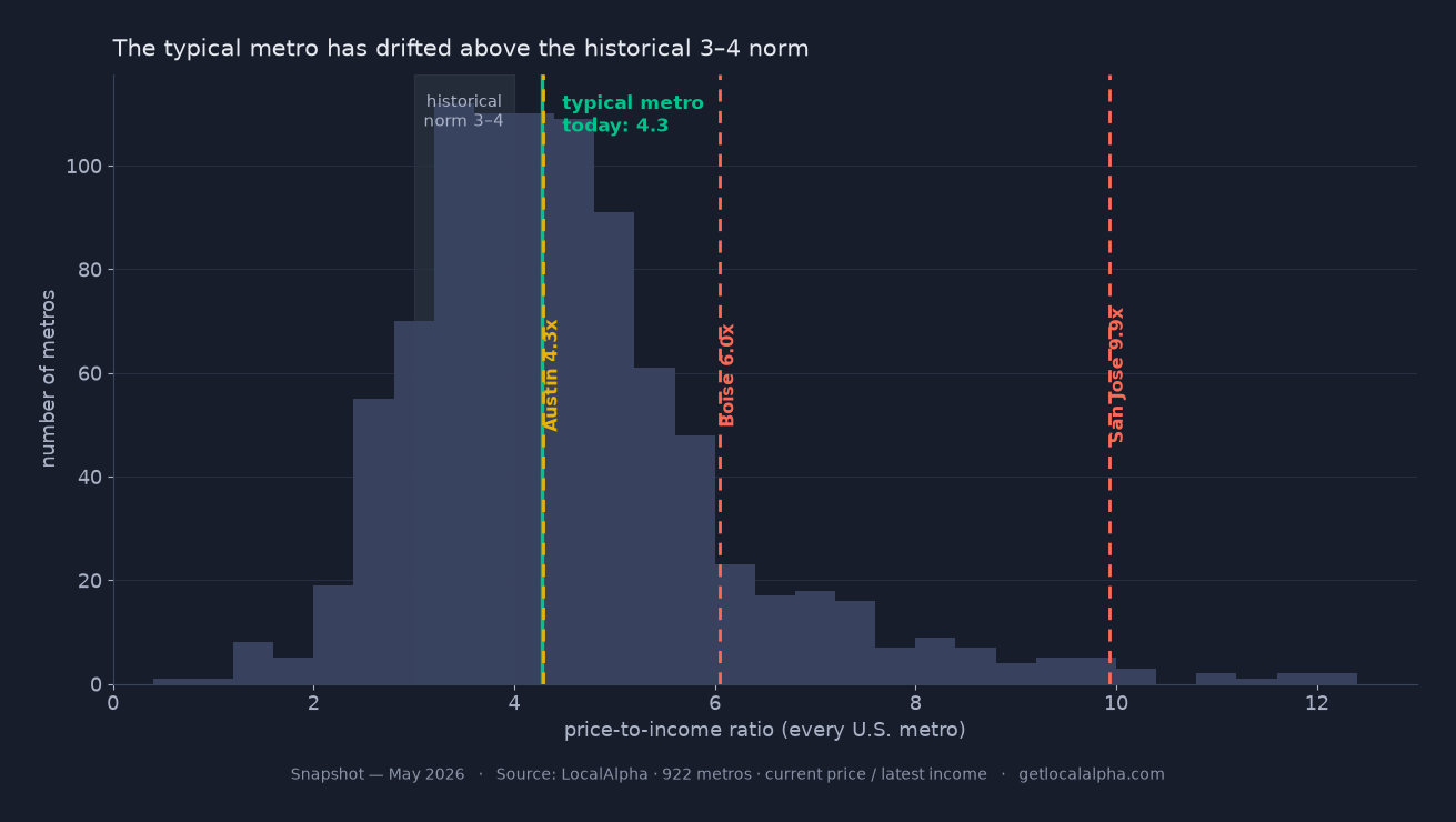
Price-to-income is the median sale price divided by median household income. Both are public: the Census Bureau's American Community Survey for income, and local sales records or a public price index for the price. The long-run "balanced" range NAHB and CoreLogic tracked for decades was about 3 to 4 — but the typical U.S. metro has since drifted above it, closer to 4 to 5 today, so the whole country reads a notch more stretched than its own history. When a single market pushes past 5, and well beyond its own past, prices have climbed faster than local paychecks can follow — the clearest single sign that value has run ahead of fundamentals.
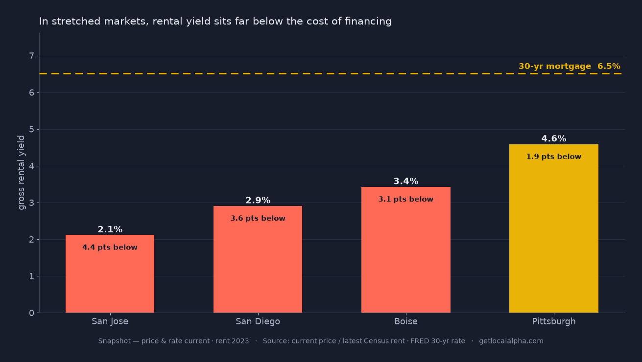
Two honest caveats keep this from being a blunt instrument. First, it is a ratio of medians — the median buyer is not the median household, since buyers skew higher-income and renters pull the income figure down, so the raw level reads a touch high everywhere. That is exactly why the trend matters more than the number. Second, for an investor there is a sharper cousin: price-to-rent. Dividing price by annual market rent compares the same asset on both sides — no median mismatch — and a yield that compresses below your cost of financing is overvaluation you can feel in the cash flow. Read both; they answer the same question from two angles.
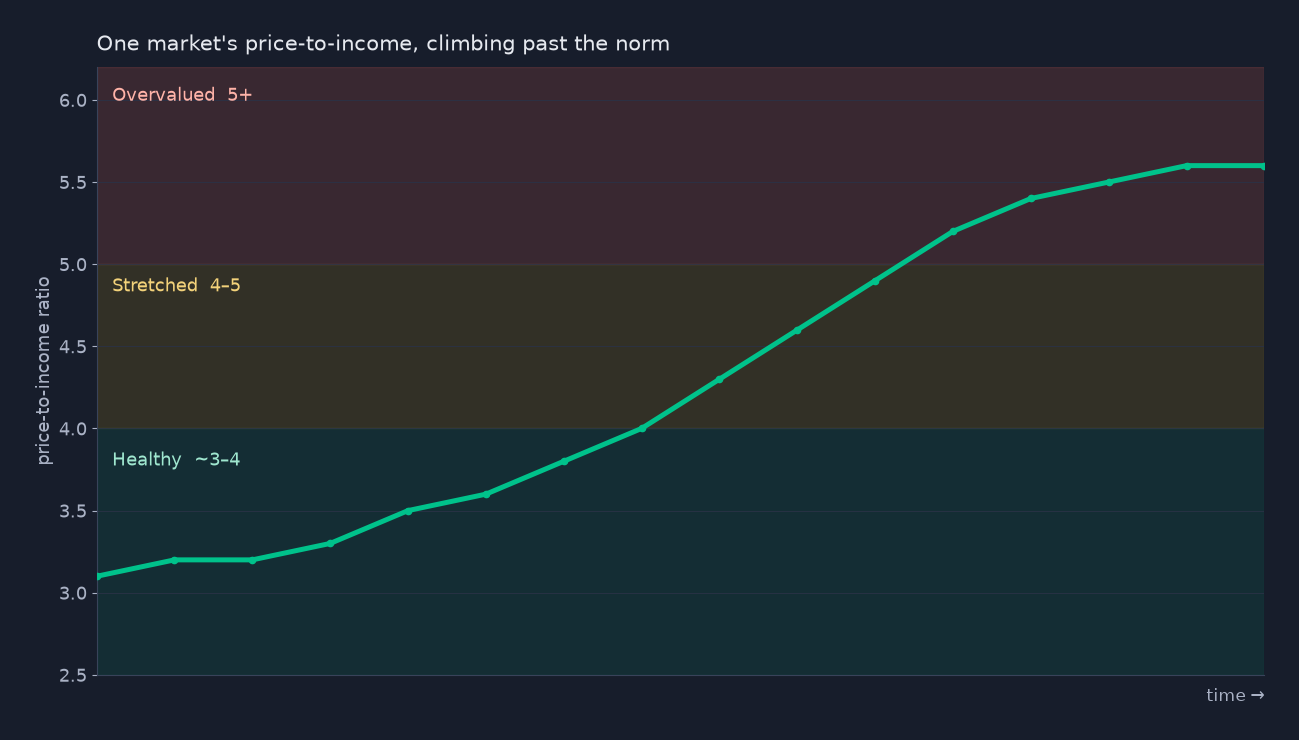
The pitfall is treating one national number as gospel. Expensive coastal metros carry structurally higher ratios because land is scarce and incomes are high, and they can sit above 5 — or above 8 — for years without crashing. A market at 8x its income is not news; that is the coastal premium. A market that climbed from its own 3.5 to 5 in three years is the news. So read price-to-income against the market's own five-to-ten-year trend, not against Topeka: the move off the market's own baseline is the signal, the raw level is not.
Signal 2: Does the mortgage payment eat too much income?
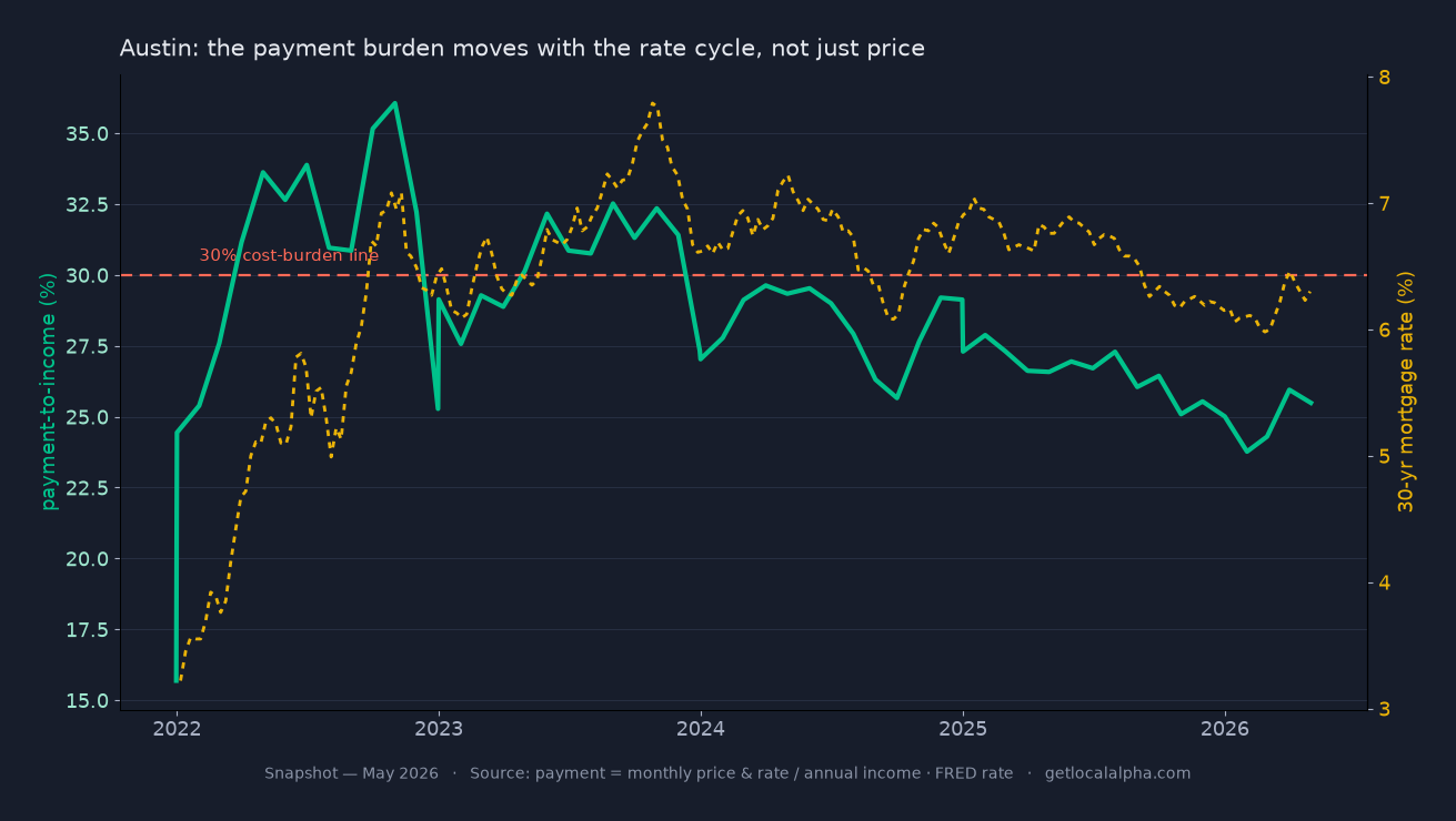
Price-to-income ignores interest rates. This signal does not. It asks what share of the typical local income the monthly payment on a median-priced home would consume, using the prevailing 30-year mortgage rate, which the Federal Reserve publishes weekly. The long-standing affordability line is 30 percent of income, the same threshold HUD uses to define a cost burden. When the payment on a median home blows well past 30 percent of median income, the market is leaning on cheap credit or outside money rather than local demand.
Here is what makes this signal sharp: it can flip a market into overvalued territory with no change in price at all. When rates rise, the same home costs more every month, so affordability cracks while the sticker price holds. A market that looked fine on price-to-income can fail this test the moment the rate cycle turns.
Signal 3: Is inventory unusually tight?
Months of supply is how long it would take to sell every home currently listed at the current sales pace, and it comes straight from public listing data. Four to six months is balanced. Under two months is a tight market. Tight supply is the mechanism that lets prices overshoot — when there is nothing to buy, buyers bid each other up — but read it carefully, because tight does not always mean hot. Much of the 2022–2024 supply crunch was a lock-in effect: owners sitting on 3% mortgages would not sell into 7% rates, so supply stayed thin even where buyer demand had cooled. Persistent sub-two-month supply with prices still climbing is the pressure that pushes the first two signals into the red; sub-two-month supply with prices flat is often just frozen sellers.
Do not read tight inventory as a verdict on its own. A growing city with genuine demand can run tight for years and stay fairly valued, because incomes and rents rise alongside price. Inventory earns its place by explaining why the affordability signals are stretched, not by flashing on its own.
Signal 4: Is momentum cooling while prices stay high?
Two numbers catch a market topping out, and both are public. The sale-to-list ratio tells you whether homes still sell at or above asking; once it slips below 100 percent, buyers have stopped chasing. The share of listings with price drops tells you the same story from the seller's side. High prices paired with a falling sale-to-list ratio and a rising share of price cuts is the signature of a market that ran hot and is now turning.
One soft month is not a turn. Housing has a strong seasonal rhythm, and almost every market cools into the fall. Read the trend over several months, and against the same months a year earlier, before you call momentum broken. A genuine top shows up as a steady slide, not a single weak print.
Signal 5: Has price run past its own long-run trend?
The last test is the market against itself. Compare today's price to its five-year trend and to its all-time peak, using a consistent public price index such as the FHFA House Price Index. A market tracking its own trend is digesting growth at a healthy pace. A market sitting far above trend, or pinned near an all-time high while the other signals flash, has stretched.
This is the context check that keeps you from calling every expensive market a bubble. Price far above trend is only a warning when the fundamentals are not there to justify it. Pair this signal with the first two: above-trend prices plus stretched affordability is the combination that matters. Above-trend prices on rising incomes is just a market that grew up.
Healthy vs. overvalued, signal by signal
Here is the whole framework on one screen. The bands are rules of thumb, not bright lines, and the real read is always the cluster and the trend, not a single cell.
| Signal | Healthy | Stretched | Overvalued |
|---|---|---|---|
| Price-to-income ratio | ≤ ~3.5 (near the 3–4 norm) | 4–5 | 5+ (read vs. the market's own history) |
| Mortgage payment-to-income | Under ~25% of local income | Near 30% (the HUD line) | Well past 30% |
| Months of supply | 4–6 (balanced) | Under 2 (tight) | Sub-2 with prices still rising |
| Sale-to-list & price drops | At or above list, few cuts | Sale-to-list slipping toward 100% | Below 100% with price cuts climbing |
| Price vs. 5-year trend | Tracking its trend | Running above trend | Far above trend or near peak with others red |
Read the signals as a cluster, not a verdict
No single signal is a verdict. Each one has an innocent explanation: a coastal premium, a seasonal dip, a city growing into its prices. Any one of them, on its own, is noise as often as signal.
The read is the cluster. When three or four point the same way at once — price stretched, payments stretched, supply tight, momentum cooling — the innocent explanations run out. That configuration is what turns "expensive" into "overvalued."
What should you do when a market looks overvalued?
Overvalued is a caution flag, not a stop sign. Plenty of money has been made in stretched markets and lost in cheap ones. The point of the signals is to make you price the risk instead of ignoring it.
So when the cluster lights up, do three things. Widen your assumptions, and underwrite flat or falling appreciation instead of a continuation of the run. Lean on the parts of the deal that survive a downturn: a strong rental yield and a long holding horizon. And let it sharpen your patience, because an overvalued market often hands you a better entry six months later, once momentum cools and the price cuts from Signal 4 do their work.
The catch: that's five sources, per market
Here is the honest friction. Doing this right means pulling income from the Census, the mortgage rate from the Fed, inventory and sale-to-list from listing data, and price-versus-trend from a house-price index, then normalizing all of it, for every market you are weighing, every month. It is entirely doable. It is also a spreadsheet you will quietly stop updating.
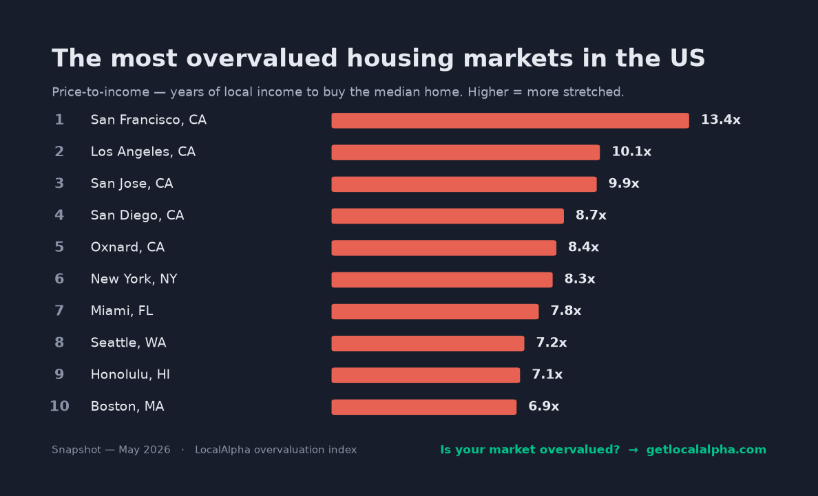
Run the five signals across every U.S. metro, though, and the map of risk falls right out. Here are the most stretched large markets at the moment — the same framework, applied everywhere at once:
That assembly is what LocalAlpha does for you. It pulls all five signals from the same public sources, scores every U.S. market on them, and rolls the affordability, inventory, and momentum reads into one number with the breakdown underneath. You read one score instead of maintaining five feeds. Every source and formula is on the methodology page, for the same reason this article exists: no black box.
Here is where that cluster lands in the product. The Alpha Score is a general read on a market — it blends affordability, price momentum, supply, the local economy, and rental yield into one number, to surface markets worth a look. Overvaluation shows up in one of those bars in particular. Pull up Boise, and watch which bar is on the floor:
Wise County, TX
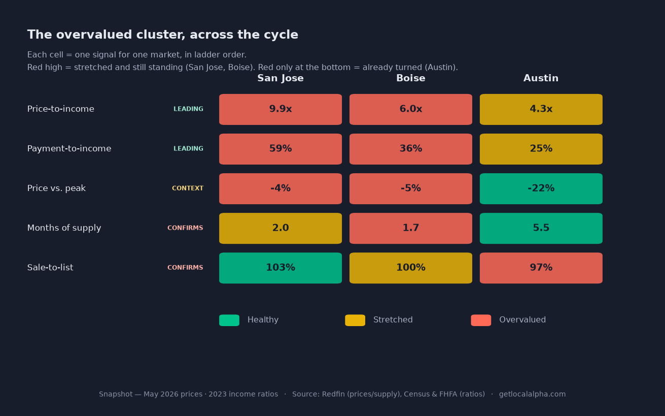
Boise is a clean case. Its price-to-income climbed from the low 4s into the 6s in a few years as out-of-state money poured in — a market moving up its own ladder, not just an expensive one. The affordability bar is on the floor, dragging an otherwise-middling score down: that is where overvaluation lives.
But notice what the headline bars don't show. The general score won't surface the whole cluster on its own — tight supply, one of the warning signs, actually reads as healthy here, because scarce inventory is good for an investment even as it props up an overvalued price. That is the tell that a general score answers a general question. To see overvaluation you read the affordability bar and the five signals together — the scorecard above, every value checkable on the methodology page. No black box; just the right lens for the question.
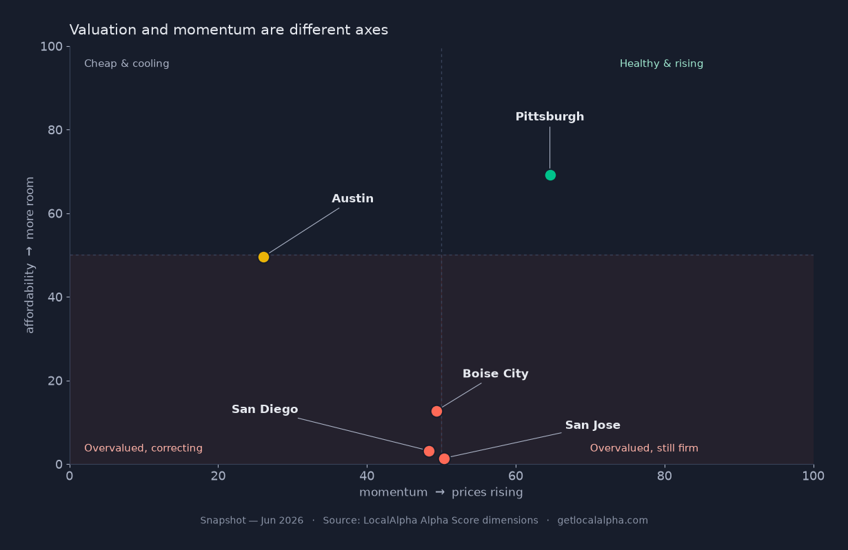
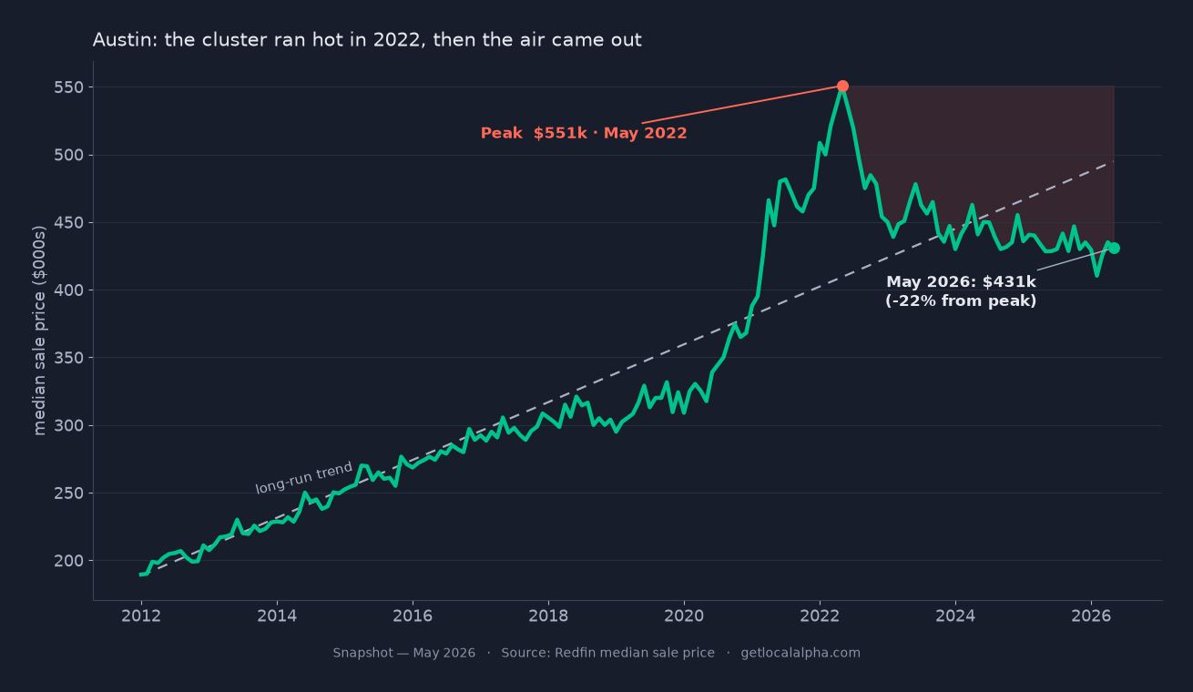
Now watch the other side of the same ruler. Austin ran this exact cluster at its 2022 peak — stretched ratios, tight supply, prices at an all-time high. Then it corrected more than 20%, supply ballooned back past five months, and the payment burden eased below the line. Today Austin reads balanced, not overvalued. The tell between still overvalued and already corrected is the supply bar: tight with prices near peak means the air is still in; loosening with prices off their high means it already came out. The 60-second read walks the same bars for any metro, and the most underrated markets sit at the far end, where price still trails the fundamentals.
Frequently asked questions
What does it mean for a housing market to be overvalued?
It means prices have climbed faster than the fundamentals that support them: incomes, rents, supply, and the market's own long-run trend. Overvaluation is about the gap between price and those anchors, not the absolute price level. A pricey market can be fairly valued and a cheap one overvalued.
Is a high price-to-income ratio always a problem?
No. Expensive coastal metros carry structurally higher ratios because of land scarcity and high incomes, and they can hold those levels for years. Read price-to-income against the market's own history and the other four signals, not against a single national number.
Can a market be overvalued and still a good investment?
Sometimes. Overvaluation raises the risk that appreciation stalls, but a strong rental yield or a long time horizon can still make the math work. It is a caution flag, not a stop sign, so size your assumptions for flat prices and let yield carry the deal.
How is overvalued different from a hot market?
A hot market has tight supply and rising prices, which describes demand, not value. A market can be hot and fairly valued, or cool and overvalued. See what makes a market hot for the forces behind the heat.
Can a market be a buyer's market and still overvalued?
Yes, and the two are measured on different clocks. Overvaluation is a level — how far price has stretched from incomes and rents — and that gap can stay wide for years. Buyer-versus-seller is a direction: which way prices are leaning this quarter. A market can carry a deeply stretched valuation and trade soft at the same time. High valuation tells you how far price could fall, not that it is falling right now.
Is price-to-rent better than price-to-income?
For an investor, often yes. Price-to-rent compares the same asset on both sides — the home and what it earns — so it avoids the median-buyer-versus-median-household mismatch baked into price-to-income. When the gross yield compresses below your cost of financing, that is overvaluation you feel in the cash flow. Read both: income for the household picture, rent for the investment picture.
Does a rate change really matter that much?
Yes. Because affordability is measured on the monthly payment, a jump in mortgage rates can push a market past the 30 percent cost-burden line with no change in price at all. That is why the payment-to-income signal often turns before the sticker-price signals do.
Where can I check these signals myself?
Every input is public: income and rent from the Census Bureau, mortgage rates from the Federal Reserve, inventory and sale-to-list from listing data, and price-versus-trend from the FHFA House Price Index. Note the cadences differ — income and rent refresh annually while prices and listings refresh weekly — so the affordability read lags the price read by design. LocalAlpha assembles all of them per market, and the methodology page lists the formulas and sources.
Overvalued is not a feeling about high prices. It is a gap you can measure on public data, signal by signal. Run the five before you act on a market, not after.
— Brian
P.S. The fastest version of this: pull up the market you are eyeing and the one you already own, and read the affordability bar on each. If the gap surprises you, the signals are doing their job.
Pull up any market and read its affordability, inventory, and momentum for yourself.
Explore the mapLast updated Jun 29, 2026