Market analysis
In 559 Markets, Buyers Stopped Paying Whatever the Seller Asked
In 559 ZIP codes sellers gave up more than a point of asking price while the sale price itself kept rising — and in 428 of them the median ask had gone up, not down. The gap is worth about $6,700 more than it was a year ago, and it is the rarest this has been in four years.
In 559 American ZIP codes, sellers gave up more than a point of asking price this year while the sale price itself kept rising — and in 428 of them the median ask had gone up, not down. In the typical one, a house now sells for about $4,400 less than the seller asked.
A year ago, a house in that same ZIP code sold for slightly more than the asking price. Buyers are still paying about 98.5% of it, so nobody has walked away. But that swing is worth roughly $6,700 of negotiating room that did not exist in March 2025.
That $6,700 gap is the finding. The rest of this piece is how we measured it, where the 559 markets are, and how to spot one yourself.
Why it happens
Two things shifted underneath these markets. Houses are taking 4.5 days longer to sell than they did a year ago, and the number of homes for sale stopped falling. In otherwise similar markets, it dropped 6.3%.
So there are slightly more houses, sitting slightly longer. Buyers have noticed and are bidding accordingly. The asking prices have not caught up.
“The price went up. The seller’s leverage went down.”
The asking price is the one figure here that somebody sets on purpose; every other number just records what already happened. Across the 559 the median ask rose 5.56%, and in 428 of them it rose outright — by 7.74% at the median in those. But in 122 the median ask came down, and those sellers still gave up more than a point of asking price — so this is not simply sellers overreaching. One caution that applies to all of those figures: a ZIP's median ask can also move because different homes were listed, not because anyone changed a price.
It is also the rarest this has been in four years
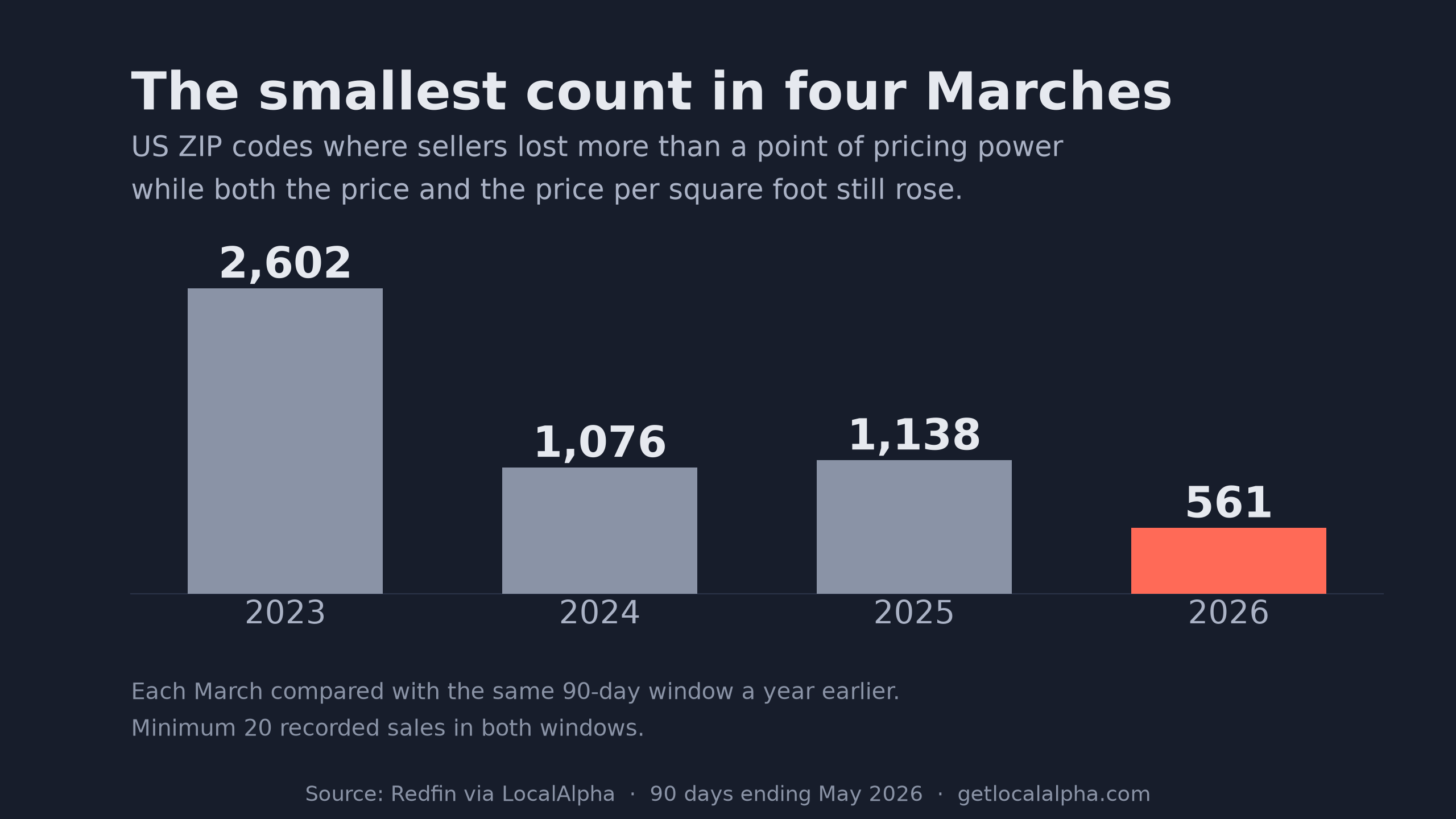
We counted these markets last week and got 559. Here is the same count for the three Marches before it.
2,602 in 2023. 1,076 in 2024. 1,138 last year.
The rule is the same in every row: compare a ZIP code with itself twelve months earlier, require at least twenty sales on both sides, and count the places where sellers gave up more than a point of asking price while the price itself kept rising. 9,577 ZIP codes cleared that twenty-sale floor in both windows this year, and 559 of them met the rest of the rule. Across those 559 the median sale is about $355,000 and the median sale-to-list ratio is 98.51% — each a median taken across ZIP codes, not two halves of one house. Multiplying the two does not reproduce the $4,400 above, and is not supposed to: medians of different distributions do not compose.
| March | Markets | National median sale-to-list ratio |
|---|---|---|
| 2023 | 2,602 | 99.31% |
| 2024 | 1,076 | 99.23% |
| 2025 | 1,138 | 98.91% |
| 2026 | 559 | 98.80% |
The national sale-to-list ratio in the right-hand column barely moves: half a point in four years. The count of individual markets giving up ground hard has fallen by nearly four fifths.
In March 2023, 7,643 of the 9,895 measurable ZIP codes gave up a point or more of asking price. Today that number is 1,880. What we are looking at is the tail of the 2023 correction, not the leading edge of something new.
What these markets look like
To see what makes them unusual you need something fair to hold them against. Not every other ZIP code: our 559 were picked partly for having rising prices, so comparing them with places where prices fell only measures that. The honest comparison is the 2,905 ZIP codes where prices also rose but sellers kept their pricing power.
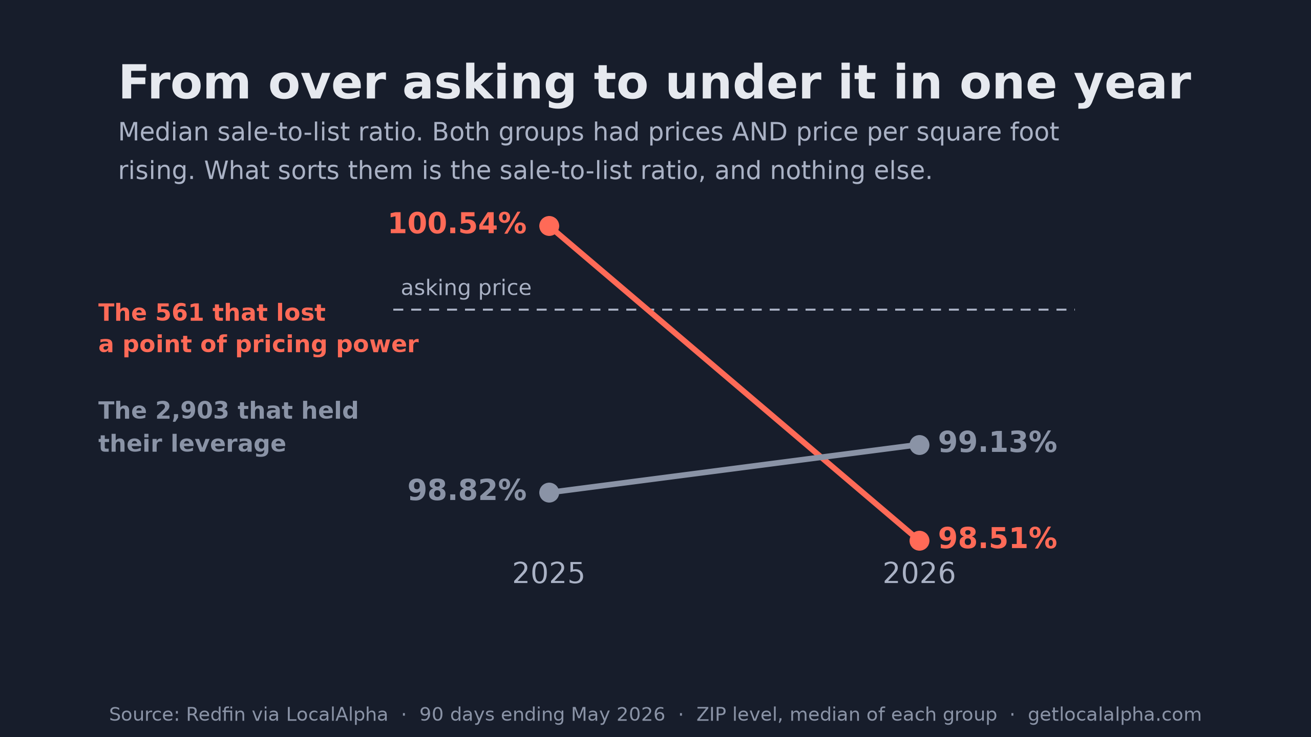
A year ago the typical market on our list sold for a little over asking. Today it sells for about a point and a half under. The comparison group went the other way.
That crossing is the part worth having. Plenty of markets sit below asking all the time. A market that was above it a year ago and is below it now is one where the seller has not adjusted yet.
The difference between the two groups is not price.
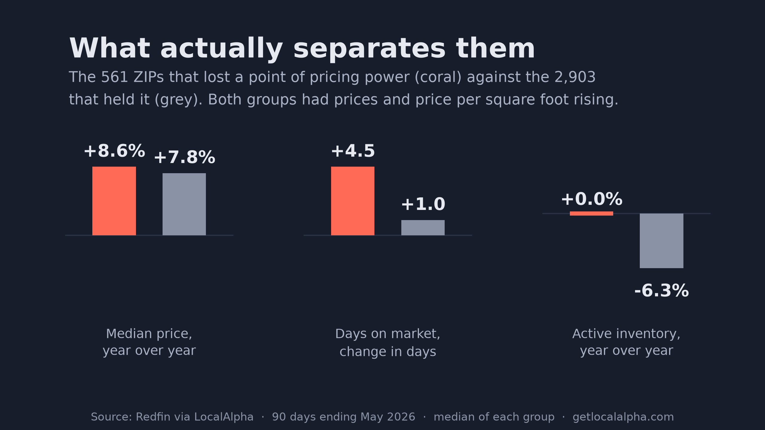
Prices rose 8.6% in one group and 7.8% in the other, which is no difference at all. The gap is in the other two: houses sitting 4.5 days longer against one day longer, and the number for sale holding flat while the comparison group watched theirs fall 6.3%.
Everywhere else that prices are rising, the supply of houses is tightening. In these 559, it stopped.
They are also not expensive markets, which matters if you are going looking for one.
- Under $200k
- 7313%
- $200k to $400k
- 24945%
- $400k to $700k
- 14326%
- Over $700k
- 9417%
Fifty-eight percent of the 559 have a typical sale price under $400,000. These are ordinary houses, not trophy properties.
Where they are
The regional shorthand this spring puts the Northeast and Midwest on the sellers’ side and hands the South and West to buyers. Our 559 are spread across 44 states, so nothing dominates outright, but the concentration runs against that summary.
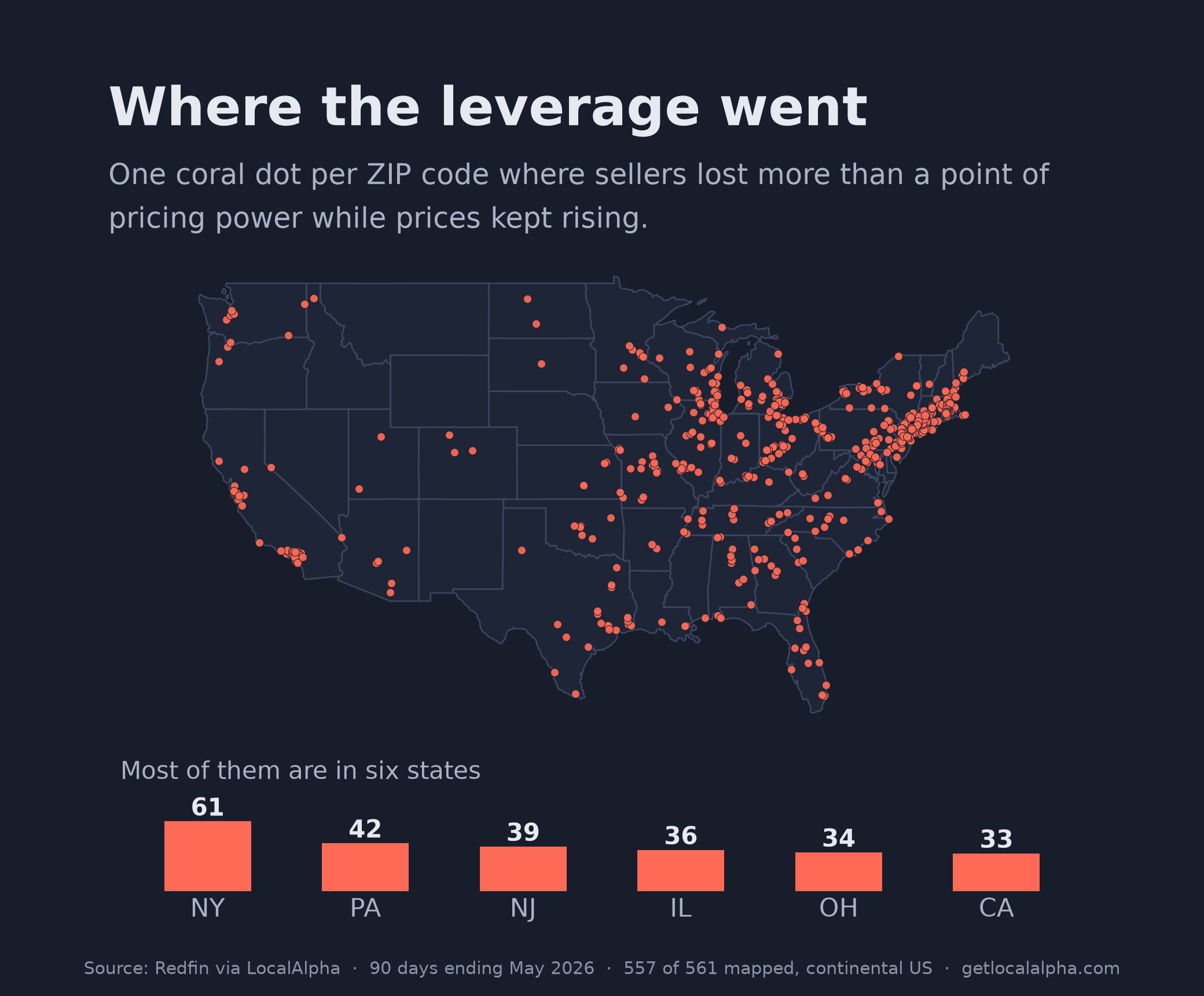
New York has 61 of them, Pennsylvania 42, New Jersey 39, Illinois 36, Ohio 34. The five states holding the most markets where sellers lost ground are the ones the regional read calls seller-friendly.
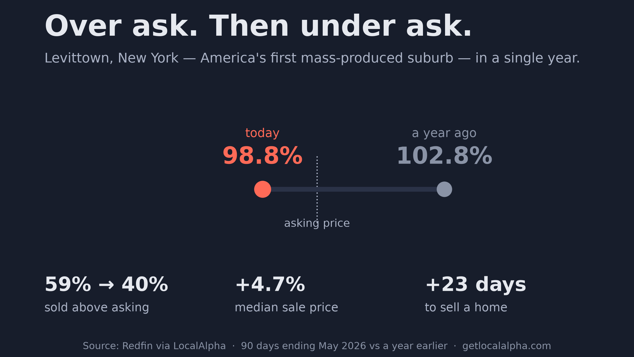
Levittown, the town we opened with last week, is one of the 61.
A regional average hides a state. A state average hides a ZIP code. Buy at the level you actually buy at.
What it does not tell you
It would be easy to read the 559 as a warning that those markets are about to fall. That is testable rather than arguable. The same rule run on March 2025 flagged 1,138 ZIP codes, so we followed those 1,138 for the next twelve months.
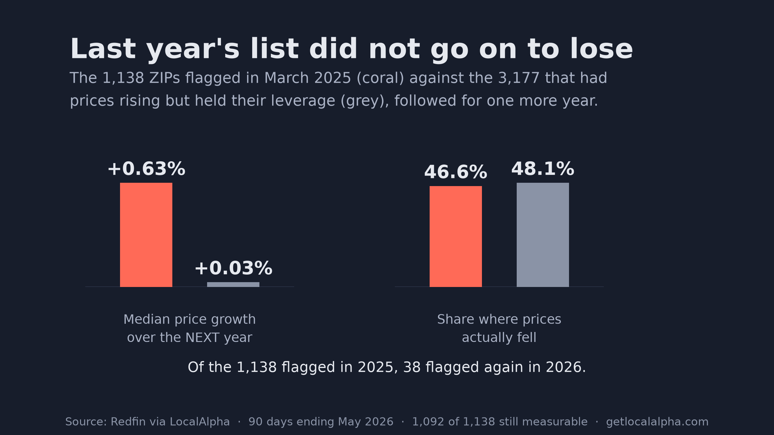
The flagged markets grew 0.63% over the following year. The comparable markets grew 0.03%. Prices fell in 46.6% of the flagged group and 48.1% of the comparison. Being on the list bought you nothing, in either direction.
The list also does not stick. Of the 1,138 markets it caught in 2025, 38 were still on it a year later.
So the measure is a snapshot of which sellers will take less money today, and nothing more than that. It says nothing about next year. The turnover is why waiting costs you: 521 of this year’s 559 were not on last year’s list, so each one is a roughly one-year window rather than a category you can come back to.
How to spot one yourself
You do not need our data for this. These are the conditions to look for, not a test all 559 pass: 152 are selling below asking where a year ago they were not, and 428 saw the median ask rise. (386 sit below asking today, but 234 of those already did a year ago.) What every one of them shares is the fall itself — more than a point of asking price given up while the price kept going up.
The four conditions
- Homes are selling for less than the asking price, where a year ago they were not.
- Asking prices are still going up, so the seller has not adjusted to it yet.
- Houses are taking longer to sell than in neighbouring markets.
- The number of homes for sale has stopped falling, so more competition is arriving.
Any one of those on its own is noise. A house sitting a week longer means nothing; one quarter of softer offers means nothing. Together they describe a seller whose expectations are running about a year behind their own street.
If you would rather start from our list than build your own, here are all 559 ZIP codes with what each one sold for against asking, how far that moved, and how long homes are sitting. Worth knowing before you open it: 386 of the 559 are already closing below asking, and 173 are not — those simply fell a long way from selling well over it.
If you are the one selling in a market like this, the same four conditions say price it where the last three sales landed, not where the last three listings started. Four in five measurable markets held their pricing power this year. Worth knowing which side of that split you are on before you pick a number.
Open the Levittown market page and watch the two lines pull apart.
See the full market page
P.S. The forward test is the part I keep poking at. It follows one group of markets for one year, and a year in which almost everything flattened out, so it is a weak test rather than a clean answer. If a second year says the same thing I will believe it properly. The 2024 column still bothers me too.
Frequently asked questions
What does "losing a point of pricing power" actually mean?
Every sale has two numbers: what the seller asked and what the buyer paid. Average those across a ZIP code and you get a percentage — 99% means homes sell for 1% under asking. When that figure falls by more than a full point in a year, sellers are accepting meaningfully bigger discounts than they were. That is the measure this whole piece is built on.
Does this mean your first article was wrong?
No. Every figure in it holds. What it was missing is the four-year comparison, which changes how you read 559: as the last of a correction rather than the first sign of one.
Are these just markets that had the most room to fall?
Partly, yes, and it is the fairest objection to the whole measure. Picking markets where the figure dropped more than a point favours the ones that started high, so the fact that the group averaged just over asking a year ago is the selection rule showing through as much as it is a discovery. That is one of the reasons we ran the forward test, and why its negative answer is reported here rather than left out.
Why compare against 2,905 markets instead of the whole country?
Because our 559 were chosen partly for having rising prices, comparing them with every other ZIP code measures the price condition rather than the negotiation one. Against the whole measurable set they appear to have wildly stronger price growth, 8.6% against 0.9%, which is nothing more than the selection rule restated. Against markets that also had prices rising, the gap is 8.6% against 7.8% and the real differences show up in days on market and inventory instead.
Why measure March to March instead of the most recent month?
Comparing a ZIP code with the same season a year earlier removes seasonality without needing to model it. Redfin ZIP data comes in 90-day windows, so each March figure covers roughly March to May.
Why require twenty sales?
A ZIP code with a handful of sales can swing several points on one house. The floor applies to the current window and the year-ago window both. Applying it to only the current window nearly triples the count.
Is 2023 as far back as this goes?
We can measure further back, but the answer stops being useful. A 2022-versus-2021 count sits entirely inside the low-rate market. The 2023 column carries the rate shock on one side, which is exactly why it reads as a nationwide correction rather than a baseline.
Methodology: Redfin data via LocalAlpha; full detail on the methodology page. ZIP level, 90-day observation windows ending in May, each compared with the same window twelve months earlier, minimum twenty recorded sales in both. "Lost a point of pricing power" means the average sale-to-list ratio fell by more than one percentage point; comparison groups meet the same price conditions and differ only in that ratio. Counts are computed live and move as data is republished; figures as of 15 August 2026.
Last updated Aug 17, 2026