Market analysis
The Price Says Up. The Negotiating Table Says Otherwise.
In 559 neighborhoods, sellers are accepting a bigger discount to asking while the median price keeps rising — and the ratio is the one that cannot be faked.
Scores in this article were computed under our previous method (before our scoring method changed), which also used Redfin and Zillow data. The Alpha Score is now built only from public government data, so today's scores for these markets may differ. Inventory Health in particular measured how tight supply was then; it now measures new building for a place's size.
In 1947, Levitt & Sons started building houses on seven square miles of Nassau County potato fields, about thirty miles east of Manhattan. They put up as many as a hundred and fifty a week, 17,447 in the end, and sold the first Cape Cods to returning GIs for around seven thousand dollars. No money down, about sixty dollars a month.
The entire point of Levittown was that an ordinary person could buy a house without a fight.
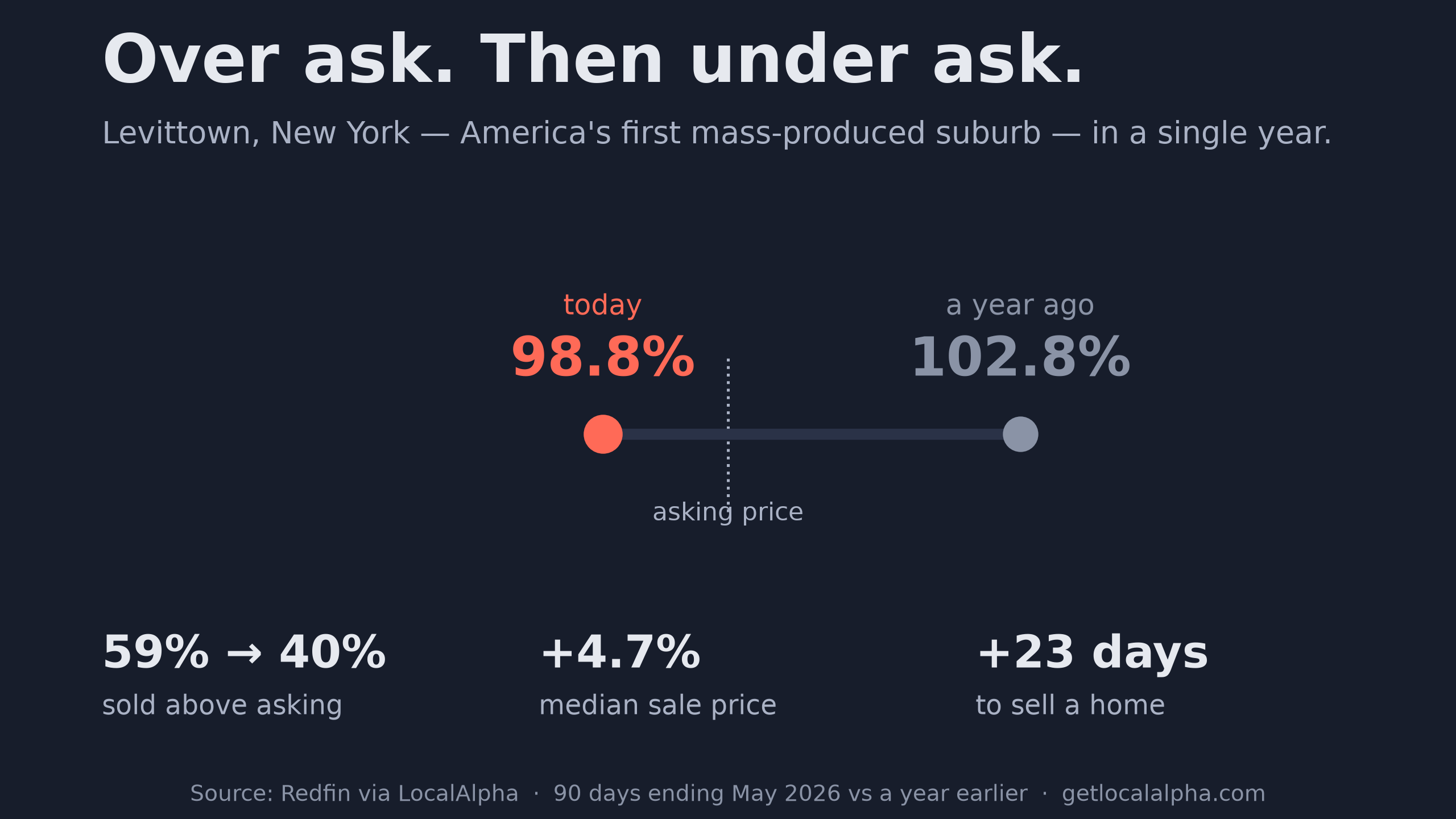
A year ago, homes in ZIP 11756 — Levittown, New York — were selling for 102.8% of their asking price. Nearly six in ten closed above list. If you wanted one, you paid what the seller asked and then some, and you were grateful for the chance.
That is over. Homes in that ZIP now sell for 98.8% of asking, under list. The share closing above list fell from 59% to 40%. Buyers there are saying no for the first time in years.
Here is the part that makes it interesting: the ZIP's median price went up 4.7% anyway, to $728,000. If you only watched the price, you would think nothing had changed at all.
| Measure | A year ago | Now |
|---|---|---|
| Sale-to-list ratio | 102.8% (over ask was the norm) | 98.8% (under ask) |
| Sold above asking | 59% of sales | 40% of sales |
| Days to sell | 21 days | 44 days |
Three measures of seller leverage, all moving the same way, in twelve months — while the price moved the other way. The one that is easiest to miss is the last: a home that took three weeks to sell now takes six.
None of that comes from our Alpha Score, which is built from a completely different set of inputs. So it is worth asking whether the score sees the same thing.
It does. Read those two middle bars together. Price Momentum sits at 64, so the price line really is still healthy. Inventory Health sits at 37, and under the method this score was computed with, that bar was inverted: a low score meant supply had loosened.
A market with rising prices and loosening supply is one where sellers are about to lose leverage. Levittown has already lost it.
The national number says nothing happened
If Levittown were the whole story it would be a curiosity. So start with the number everyone quotes. Across American ZIP codes the typical home still sells for about 98.5% of asking, down roughly a tenth of a point from a year ago. On paper, sellers barely lost a step, and every national headline this year is built on that.
A national average is a blender. Here is what it is blending.
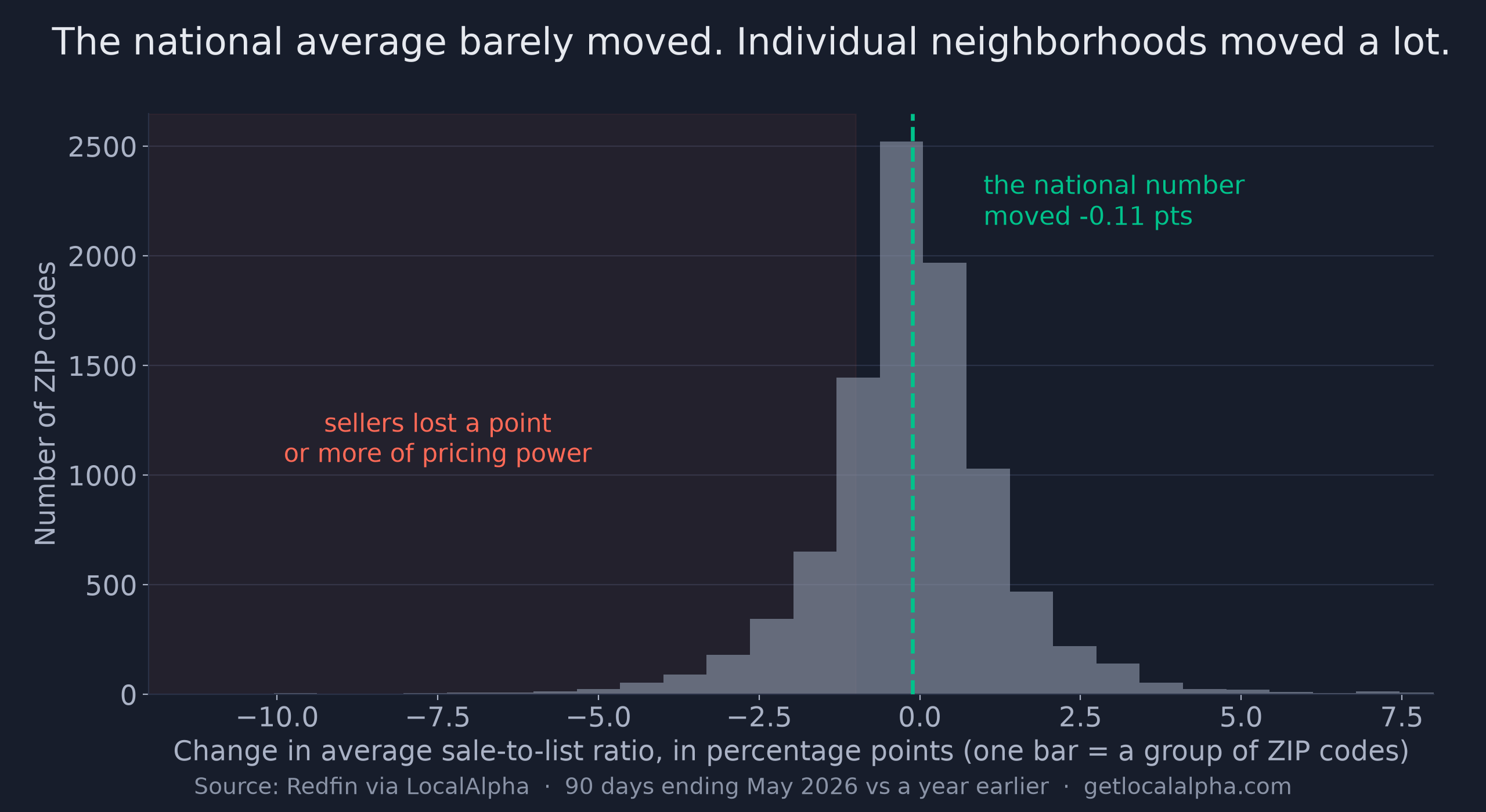
The peak is real. Most neighborhoods did barely move. But that tail is close to two thousand American neighborhoods where the negotiation changed hands, averaged into invisibility by the places where it did not. Levittown is one of them.
Why the ratio beats the price
Before going further, it is worth saying why I trust one number over the other.
Median price moves when a different mix of homes sells. A few large houses trade, the median climbs, and it looks like appreciation that never happened to any individual owner.
Sale-to-list compares what a seller got to what they asked, house by house. Mix cannot touch it.
That is why every market here had to clear a second test. Price per square foot had to rise too. If the median rose but per-square-foot fell, the "prices are up" story is a mix artifact and the market is out. That one filter removed a lot of tempting examples.
Run that filter across every ZIP code in the country and 559 markets survive it. Here they are against everywhere else.
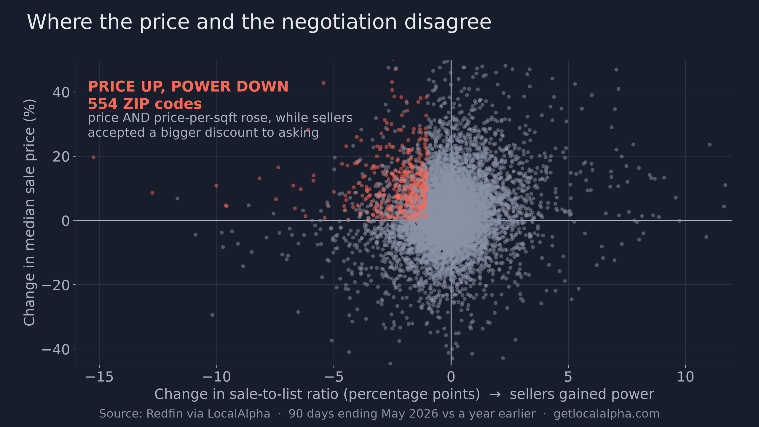
The grey cloud is the normal state of things: prices and negotiating power drifting together, in both directions. The coral cluster is where they came apart. Those are the markets worth naming.
Where the table turned hardest
These are the ten steepest losses of seller pricing power in the country among markets where prices still rose. Grey is where each one sat a year ago; coral is today. Every green figure on the right is a market whose median price went up over the same period.
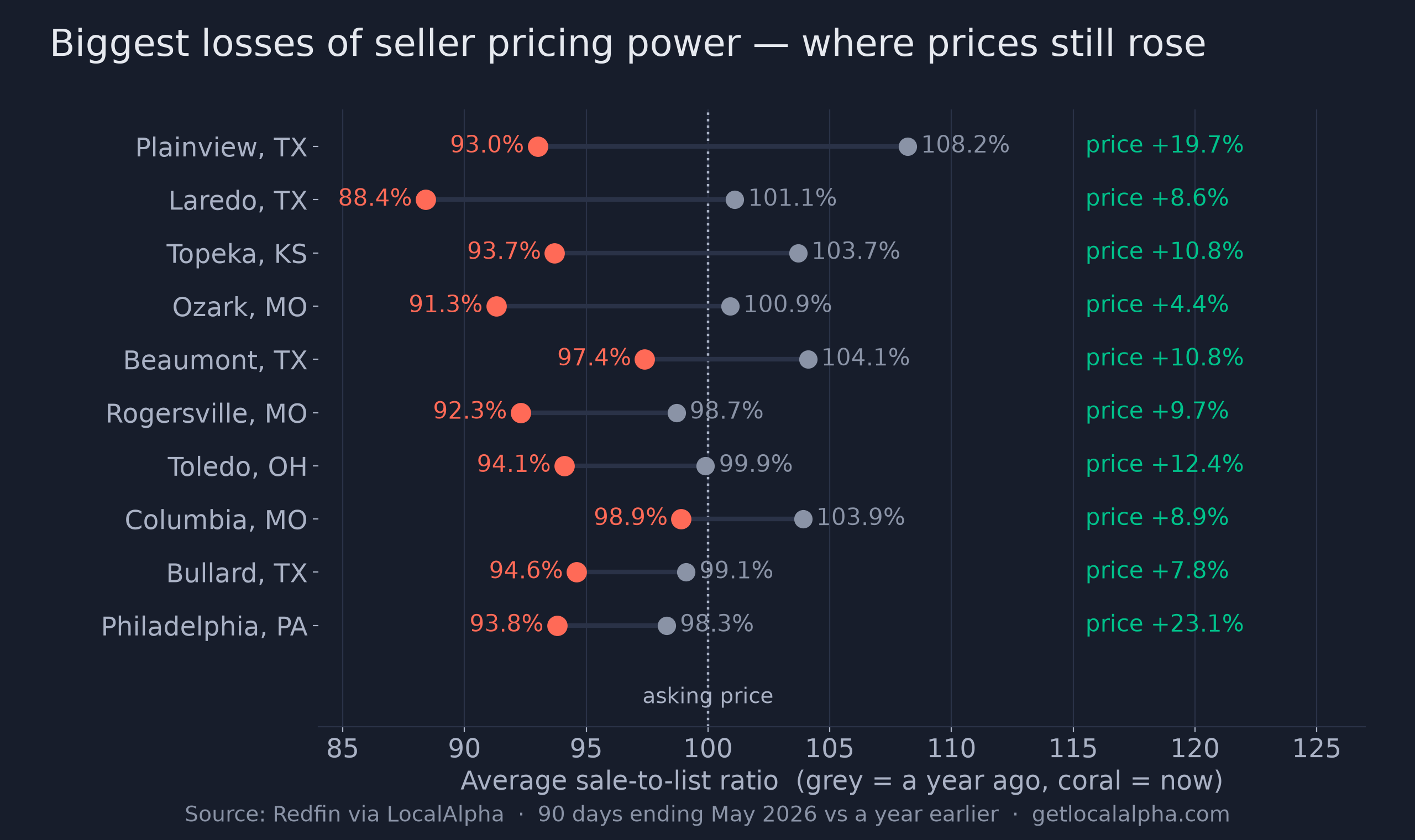
The sharpest reversal in the country is ZIP 79072, Plainview, Texas, out on the Panhandle plains between Lubbock and Amarillo. Sellers in that ZIP went from 108.2% of asking, eight full points over, to 93.0%. That is a fifteen-point swing in twelve months, and the median price rose almost 20% while it happened.
Plainview knows what a hard year looks like. In February 2013, Cargill closed the beef plant that was the town's largest employer, after drought gutted the regional cattle supply. It took about 2,200 jobs with it, close to 14% of the entire county's workforce, in a town of roughly 22,500 people.
A place that has absorbed that does not panic over a housing statistic. It is still worth noticing when the people buying homes there stop paying over ask.
ZIP 66614 in Topeka, Kansas lost ten points of pricing power on 140 sales, one of the largest samples in the set, in a state capital with a steady government payroll underneath it. ZIP 77656, in Hardin County, Texas, in the piney woods outside Beaumont, went from 98.5% to 88.9%: more than a dime on the dollar in negotiating room, while prices rose 4.7%.
What does not confirm — and why we are telling you
Which raises the obvious question: is every one of these 559 markets cooling? It would be tidier to say yes. That is not what the data says, and the gap is worth showing.
| Supporting signal | Markets where it also confirms | Share |
|---|---|---|
| Homes taking longer to sell | 372 | 67% |
| More new listings arriving | 275 | 49% |
| Active inventory rising | 268 | 48% |
| All three at once | 135 | 24% |
Two of the markets above make the point themselves. In ZIP 77656, inventory actually fell over the year even as sellers gave up nearly ten points. In Baltimore's 21218, the Charles Village and Waverly rowhouse blocks around Johns Hopkins' Homewood campus, price per square foot jumped 12% and the share selling over list dropped from 38% to 22%. Yet new listings declined.
Neither is a textbook cooling market. Both are markets where sellers are getting less of what they ask. If I only showed you the 24% where every arrow points the same way, I would be showing you a cleaner story than the one that exists.
“Buyers didn’t stop paying more. They stopped paying whatever was asked.”
What to do with this
So here is the practical version. If you are buying in one of these markets, the price chart says it is hot and the negotiating data says it is not. That gap is where your room lives.
Ask your agent one specific question: what did the last ten comparable homes sell for relative to their asking price? In Levittown a year ago the answer was "over." Today it is "under," and that is the whole difference.
If you are selling, the frenzy is already over where you are — the list price just has not heard yet. Price to the market that exists now, not the one your neighbor sold into last spring.
You can run this read on your own market in about a minute. Open its market page, find the sale-to-list ratio, and compare it to where it sat a year ago. If the ratio is falling while the price line rises, you are in one of these.
See the full market page for ZIP 11756 (Levittown, NY).
See the full market page
P.S. If something in here nags at you, my guess is it is the 24%. Three quarters of these markets do not show the full cooling picture, and that is a reasonable thing to sit uneasily with. My read is that sale-to-list tends to move first and the rest catches up unevenly. Worth checking again in a couple of quarters.
Frequently asked questions
What is the sale-to-list ratio?
What a home actually sold for divided by what it was listed at, averaged across sales. Above 100% means buyers are paying over asking; below 100% means sellers are accepting less than they asked.
Why can median price rise while sellers are losing power?
Median price reflects which homes sold, not what each seller conceded. If a larger or higher-end set of homes changes hands, the median climbs even as individual sellers accept bigger discounts. Sale-to-list measures each sale against its own asking price, so the mix cannot distort it.
How were these markets selected?
ZIP codes where the average sale-to-list ratio fell by more than a full point year over year, the median sale price rose, and the median price per square foot also rose, counting only ZIP codes with at least 20 recorded sales in both the current and the year-ago window. The price-per-square-foot test is what separates a real price gain from a change in the mix of homes sold; requiring the sales floor on both sides stops a market with almost no sales a year ago from producing a meaningless comparison.
Does a falling sale-to-list ratio mean prices will drop next?
Not necessarily, but it is the earlier signal. Negotiating room usually opens before list prices adjust. It tells a buyer where to push and a seller where the market has already moved on.
Metric: average sale-to-list ratio, per Redfin data, ZIP level, 90 days ending May 2026 versus the same 90-day window a year earlier. Both sides use the same window length, and the ratio is immune to changes in the mix of homes sold. Charts are generated directly from the database and stamped with their as-of date. See the methodology.
Last updated Sep 29, 2026